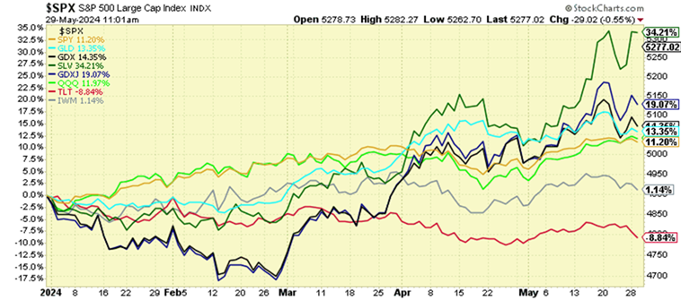
If you’ve ever wondered why financial media doesn’t talk more about things other than stocks and bonds, it’s generally because it doesn’t serve the business model that allows them to survive, which is another way of saying, there isn’t as much money in it. If risk-adjusted opportunity was most important, or those things that could benefit the viewer most, we’d be hearing a lot more about gold, silver, and other natural resource investments, especially given their performance so far this year. The chart below tells a pretty interesting story – the major stock market indexes are up about 11% (SPY & QQQ), but silver is up 34% (SLV), gold 14% (GLD), and miners indexes between 14 and 19% (GDX & GDXJ). That’s a pretty interesting signal within the context of the bigger picture, which we’ll discuss. What’s also interesting is that small cap stocks are only up 1% (IWM) this year while long term treasury bonds (TLT) are down ~8%. Needless to say, there’s lots going on that the casual observer might find very confusing and counter-intuitive. Additionally, these significant variations in performance across asset classes can serve as traps for those who don’t have a clear view of the bigger picture. Here’s how we interpret it…
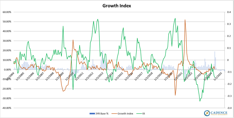
The economy remains relatively weak, which generally favors more defensive asset classes such as treasury bonds and gold over more economically tethered assets like stocks. The brown line in the chart below represents an index of economic activity and is currently hovering right around the zero-growth line relative to where it was a year ago. What you’ll also notice is that the green line, the one-year return of treasury bond prices, tends to perform well when growth slows. What we’ve experienced over the last couple years is an exception to that general rule given complicating factors such as rapid rate increases, high inflation, and the unwind of risk-parity positions (highly leveraged bond positions). The result of that bond underperformance is a rapid reset of bond rates and prices to levels much more attractive than they were two years ago, especially compared to stocks. The main point here however, is that the economy is anything but robust and healthy. The data are clear about that.
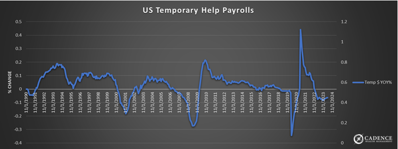
Supporting that assessment is the chart below showing the one-year change in temporary help services, which currently sits at (negative) levels commonly associated with recession.
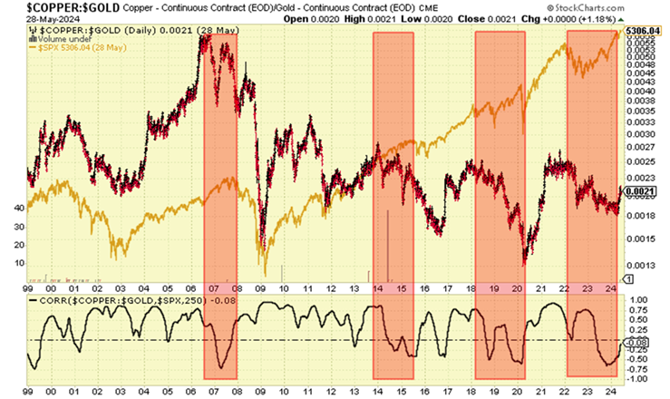
Another market-based price signal that tends to correspond with economic sluggishness and potential stock market downturns is the copper to gold ratio. The red shaded areas below show periods over the last 20 years where that ratio stalled and began moving lower ahead of more obvious slowing and falling episodes in the economy and markets. Of note is the fact that this ratio has been falling over the last two years, despite the fact that stocks have been moving higher. A stock market trap?
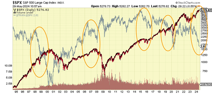
When the economy begins to slow, so does the movement of goods and services, which eventually shows up in the profitability of transportation related companies. Below, in gray, is the ratio of the Dow Jones Transportation index relative to the S&P 500, which we can see has been moving decisively lower recently. The circled areas denote previous drops in this ratio that corresponded with subsequent stock market declines, most of which also corresponded with cyclical growth slowdowns. Yet another signal that all is not as well out there as the financial media would have you believe.
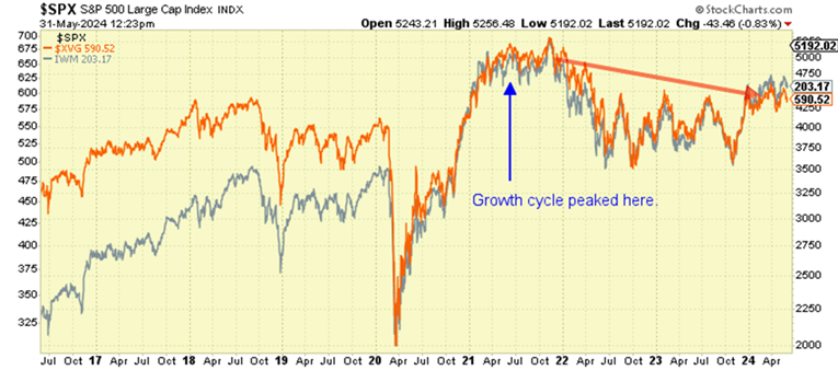
A common source of confusion amongst investors is how the S&P 500 and Nasdaq indexes can be doing so well without the economy being equally strong, and so most assume the economy actually is strong and that all stocks are doing well. As we’ve written about before, the large stock indexes are heavily skewed by a handful of the biggest tech companies and aren’t a reflection of the performance of the average company out there in the economy. Below is a chart showing the Russell Small Cap index (gray) and the Value Line Geometric index (orange) whose constituents are equally weighted and a truer reflection of the state of corporate health and performance over the last few years. What’s clear is that since late 2021, performance has been negative, and more in line with our growth index we discussed at the top of this piece.
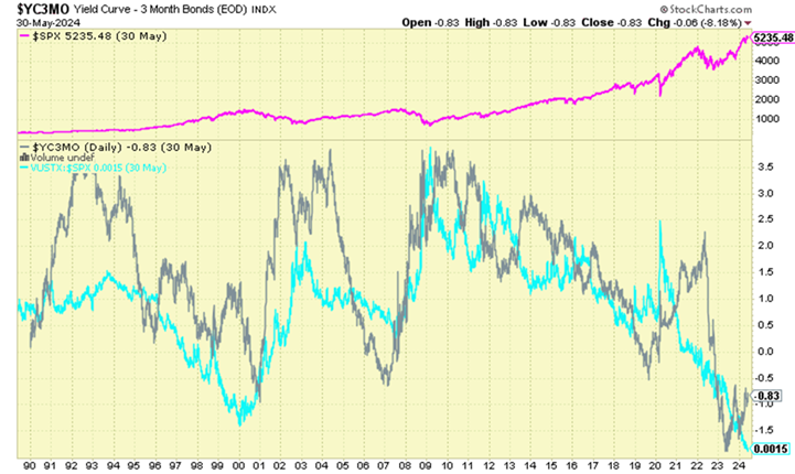
Another financial market factor that’s really important to the bigger picture is the yield curve – the difference between long-term government bond interest rates and short-term interest rates. When it’s negative, it’s very hard for banks to continue greasing the economic skids by way of lending since they make less on long-term loans and have to pay out more on deposits. As we can see from the chart below, the yield curve (gray) is negative and has been for over two years. There are two important observations to make here. First, a weak economy and stock market tend to follow a negative yield curve, and more specifically, when the curve begins rising into positive territory again. We have yet to see that. The second observation is that government bonds tend to outperform stocks when this curve normalization takes place. The blue line represents the ratio of bonds to stocks, so when it’s rising, bonds are outperforming stocks. Again, that yield curve normalization event is still ahead of us.
When it comes to investing in bonds, it can actually be a very complex endeavor. We have government and corporate bonds of varying durations, mortgage bonds, shorter term floating rate credit instruments, there are callable bonds – a good bond manager no doubt earns her keep. To keep things simple at this point however, there are a couple concepts that can help us focus in on which type and what length of bond investment we want to own the most of at any point in time. First, if the amount of interest corporate bonds are paying over and above government bonds is small (known as credit spread), then that additional risk of investing in corporate bonds may not be worthwhile, leading us to favor government bonds. This is the case now as credit spreads are historically tight. Second, we want to think about what duration of bonds makes the most sense. As a general rule, if we think the rate we’re getting is good, then we’ll want to lock that rate in for a longer period of time. If not, we’ll want to keep the duration short so that when rates are better, we can reinvest the proceeds in higher yielding bonds down the road. It’s also important to note that the price of a longer duration bond moves up and down more as current market interest rates change, so if we think rates are going higher, we’ll want to have less money invested in longer duration bonds.
Our assessment of where interest rates will go in the future is mixed based on timing. If we see further economic weakness, which as we’ve outlined, we think there’s a good chance we will, then rates will likely go lower as price inflation stays under control and money flows into “safer” alternatives to stocks. As we go out in time beyond that scenario however, we run square into the elephant in the room that is the U.S. government debt and spending problem. Recession will make the current budget deficit and national debt situation even worse than it is now since both less revenue will be coming in and additional stimulus spending will likely be initiated. This, as in 2020 will likely be inflationary, which will not be good for interest rates or bond prices. The short of it is that there will likely be a point down the road when government bonds hold more risk than high quality corporate bonds as we face the real possibility of debt restructuring in an effort to get the government back on a sustainable path. We think this threat is real for the simple reason that math is also real. Something’s gotta’ give at some point. Bonds aren’t what they once were. That said, government bonds may harbor opportunity for gain before we get to that point.
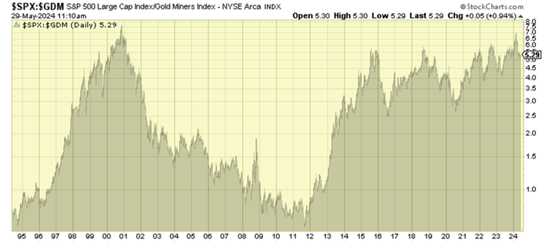
Despite the solid performance of monetary metals so far this year, there’s most likely still a good amount of runway left. There are two main reasons we feel this way. First, the big picture we’ve just painted of current economic weakness that has the potential to get worse, an irreversible government spending and debt trajectory, and the perpetual price inflation problem that will likely come from the government’s inability to confront the debt and deficit fiasco with fiscal restraint, will most likely favor monetary metals, and to a lesser extent, other commodity and natural resource assets. Second, they are still relatively cheap compared to financial assets – especially gold and silver miners. The chart below shows the ratio of the S&P 500 to an index of gold miners. As you can see, the market is just about as expensive (and miners cheap) as it was in 2000 before the market declined more than 50% and miners began their 10+ year bull run. What was a lost decade for stocks turned out to be a multi-fold increase in mining shares, from a very similar relative valuation starting point as we have now. Future returns are all about the starting point and this one seems historically good for mining shares.
To sum this all up, we see a host of current risks to the economy and financial markets. This doesn’t necessarily mean that we’re entering a clear recession next month and that markets will crash, but it does mean that there’s an uncomfortable possibility that these things could happen. To counter those risks in the short to medium term, we like the idea of buying the handful of investment asset classes that are reasonably priced at the moment – mainly government bonds, monetary metals, and some other natural resource assets. To a large extent, the bond positions will help to offset some of the risk of the latter, as too much of any one of these categories could lead to excessive volatility. Longer term, we can see avoiding government bonds altogether due to the fiscal profligacy we’ve outlined. We can also see investing less enthusiastically in commodities and natural resources down the line as those prices move higher over time. Our sense is that when those times come, there will be new opportunities that market participants will have left behind that we can incorporate. We’ll cross that chasm when we come to it. In the meantime, we’re staying focused on minimizing exposure to the things that could lose the most given the current state of affairs, and by contrast, allocating to those investments that we feel have the potential to both hold up and perform. So far in 2024, that approach is working out quite well.
Editor’s Note: This article was originally published in the June 2024 edition of our “Cadence Clips” newsletter.
Important Disclosures
This blog is provided for informational purposes and is not to be considered investment advice or a solicitation to buy or sell securities. Cadence Wealth Management, LLC, a registered investment advisor, may only provide advice after entering into an advisory agreement and obtaining all relevant information from a client. The investment strategies mentioned here may not be suitable for everyone. Each investor needs to review an investment strategy for his or her own particular situation before making any investment decision.
Past performance is not indicative of future results. It is not possible to invest directly in an index. Index performance does not reflect charges and expenses and is not based on actual advisory client assets. Index performance does include the reinvestment of dividends and other distributions
The views expressed in the referenced materials are subject to change based on market and other conditions. These documents may contain certain statements that may be deemed forward‐looking statements. Please note that any such statements are not guarantees of any future performance and actual results or developments may differ materially from those projected. Any projections, market outlooks, or estimates are based upon certain assumptions and should not be construed as indicative of actual events that will occur. Data contained herein from third party providers is obtained from what are considered reliable sources. However, its accuracy, completeness or reliability cannot be guaranteed.
Examples provided are for illustrative purposes only and not intended to be reflective of results you can expect to achieve.