Simply put, stocks have continued to rise in February while growth data has continued to weaken – fairly decisively. If all one cares about is investing in what’s currently going up, then this rally in stocks seems like a no-brainer. The only problem is that the preponderance of evidence suggests that this rally is the textbook bear market variety, which means it will likely change course just as quickly as it began. If one’s looking to generate fast losses, there’s really no better way. Our position on portfolio composition for the time being hasn’t changed. We will change it when the evidence suggests it’s a safer time to do so, but at this point, losing -50% percent in stocks has never looked easier.
Current Valuation
We’re roughly 5% from the highs established last September, which is to say if we were at record high valuations then, we still pretty much are. On a margin-adjusted 10-year price to earnings basis as well as a median price to revenue basis, we’re off the charts – higher than the 1920’s mania and 1990’s technology bubble. Those two episodes as well as the next two most expensive markets over the last 100 years all resulted in more than -50% declines in stock indices. We don’t think it’s smart to gamble our clients’ financial futures on the fact that this current scenario will end any differently. As we’ve discussed ad nauseum in the past – it’s basic math.
To put things into perspective, if you’re worried that a conservative stance recently may have caused you to miss the boat, the chart on the next page should assuage that fear at least a little. Getting back to average valuations, as we’ve done in every major market cycle to date, results in the S&P 500 on the upper right-hand side of the chart moving all the way down to the lower horizontal line right around the 1000 level. This reflects roughly a two-thirds loss in the index and does not take into consideration an overshoot, which if you believe in the definition of “average” has to happen from time to time.
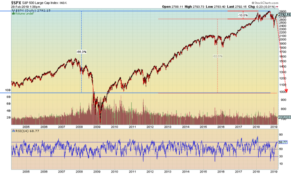
We can assure you that you won’t hear any Wall Street executives or financial media talking about price targets on the S&P 500 anywhere near the 1000 level. In fact, it’s rare that you’ll even get a 12-month price target for markets that’s negative at all. Simply put, Wall Street would rather operate in a world where the business and market cycle were one-directional. The downward part of the cycle is bad for investment assets and therefore bad for fees and business. Talking about it merely accelerates its arrival. However, cycles exist in markets just as they do in nature. Denying this fact doesn’t do anything to help investors preserve their capital over the long term. This tendency not to hear realistic assessments of the downward part of the market cycle until we’re already in one reminds us of a quote that we read once – spoken by somebody whom we’d certainly credit if we only remembered the source. “You can’t get a person to understand something when his income depends upon his not understanding it”.
Historically Weak Internals
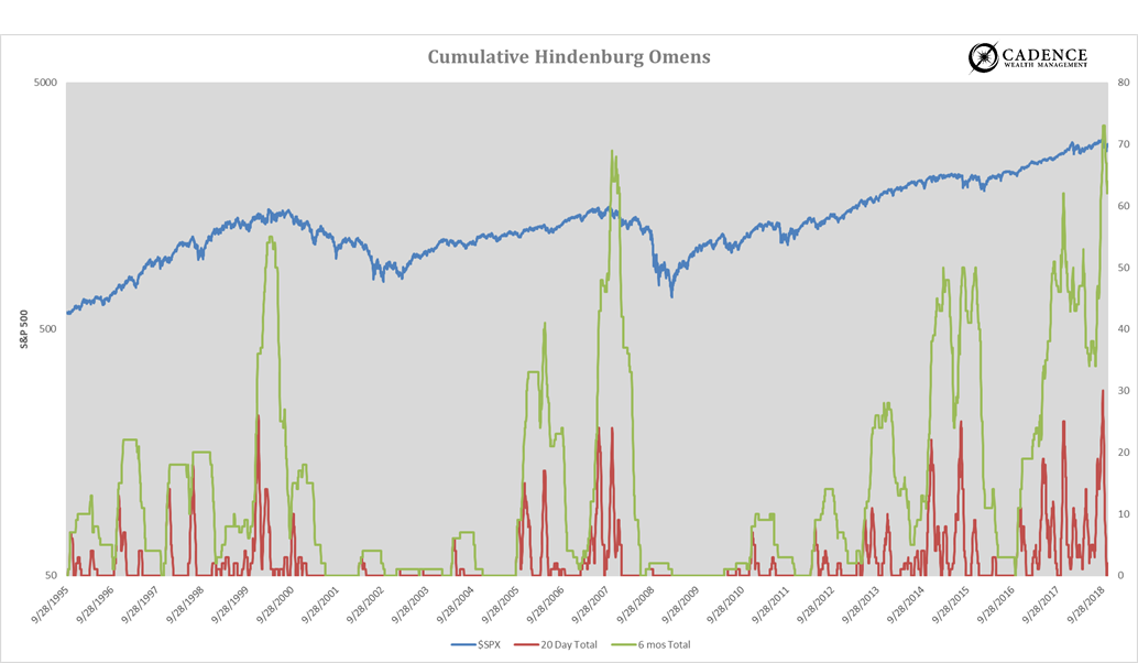
A few months ago, we discussed how even though the market indexes were reaching all-time highs, the average stock within the market wasn’t sharing in the success. We capture this phenomenon by looking at days when at least 2% of stocks on the exchange are making new lows while at least the same amount are making new highs. The accumulation of these days within a 2-month and 6-month period is what’s shown in the chart on the next page. Historically, when we see a high degree of divergence between stocks in the market, cycle turning points have tended to follow. The most recent bout of divergence (which has been rather chronic in nature the last few years) reached epic levels coming into the fourth quarter of last year. You’ll see this in the chart by the green and red lines spiking up on the right side. The green line reflects total “Hindenburg” occurrences over 6 months while the red line represents those over 2 months. Notice what happened the last time these lines were in similar territory. It’s not surprising that this most recent spike was soon followed by the worst December stock market performance in almost 100 years. It also wouldn’t be surprising, as we can see from the experiences on the next page, if that were only the beginning of a longer cyclical downturn in markets.
The Economic Cycle
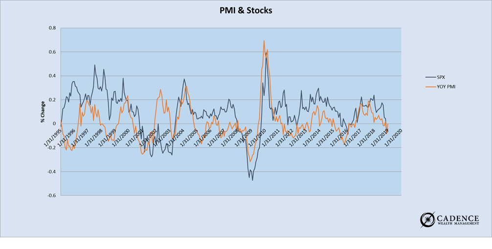
Every month the Institute for Supply Management (ISM) puts out a report that measures manufacturing activity within the economy (PMI). It’s a good proxy for what gross domestic product ultimately ends up being, which is the measure of economic activity most referenced. What we can see very clearly in looking at the year over year change in PMI is that it is very cyclical. There’s almost a rhythmic ebb and flow to the data, that not coincidently, the year over year performance of the stock market tends to rhyme with. In short, the success of companies within the economy is very closely tied to what’s happening with the economy. We could argue that they are one and the same and so long as stock prices reflect that success or lack thereof, the charts should overlap – which they do most of the time. You’ll see in the chart below the yellow (PMI) and black (S&P 500) lines which both reflect the year over year changes in each, moving in relative synchrony. Knowing that PMI is cyclical rather than linear can help us tremendously with risk management within our investment portfolio.
Another thing you’ll see from the chart below is that the trend in PMI has started a decisive move lower beginning in the fourth quarter of last year. This is reflected by the orange line on the right side of the chart. How far it will go is the million-dollar question that nobody knows for certain the answer to, but that’s not to say there aren’t clues. In search of these clues we look for supporting evidence amongst other leading economic indicators/patterns.
Assessing Broader Economic Trends
To get a glimpse into what may be happening within the broader economy, we have to look at a broader swath of macroeconomic data to see if we can spot uniformity or patterns. Most data that comes out tends to be lagging, meaning it states the obvious by the time we see it, but some can give us more of a read on what may be developing right now in real time. Below is a mix of indicators that we track that can clue us in as to where the economy (and thus business environment for public companies and by extension their shares) may be headed.
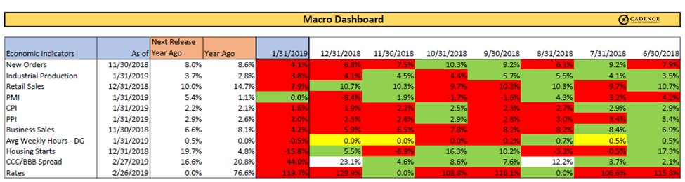
What you’ll notice in the column labeled 1/31/2019 is that it’s almost completely red. What this means is that all of these economic data points were weaker on their last release than the prior period. The trend over the last few months has been weaker, not stronger. In addition, the two columns to the left of that one shows the rate of growth achieved by each of the metrics one year ago this month as well as for the upcoming data release. In general, the greater the growth rate achieved for the same measuring period a year ago, the harder it’s going to be to achieve growth on top of that result. This in essence is how cycles work. Things grow really well for a period of time until they can’t grow at the same rate. Then growth slows and starts to go in reverse, like a ball being thrown into the air. Gravity brings it back down until it eventually lands in the hand that will toss it back up again. In short, the business cycle appears to be moving south with some pretty hefty “year-ago” period data coming up in the next few months. This makes a re-acceleration of growth on top of already strong growth a pretty tall order. We’re also seeing this same trend in corporate earnings for the 4th quarter of 2018. It’s moving the wrong way, which does not support the rapid rise in stock prices over the last 2 months. Quite the opposite in fact.
Putting It All Together
We’ve recently received some feedback that we should re-introduce the bullet points at the end of our technical pieces to make for quicker reading and a more effective synopsis. We’re not sure why we got away from it other than maybe to minimize the tendency to repeat ourselves when making points we feel strongly about. Whatever the reason, it was unintentional and this piece could probably benefit from a few choice bullets to shake you from your chart-induced slumber.
- Principal preservation remains the focus given where we are in the market and economic cycles. The potential for large stock market losses remains too high at this point to invest in stocks to any significant degree.
- The strongest of rallies occur within bear markets (longer-term downtrends). Don’t be too quick to assume the worst is over. When the data points change, we could feel better about investing in stocks again. It hasn’t yet. All evidence suggests we’re in the midst of a slowdown.
- Both market signals via stock price divergence and recent economic data point to a high likelihood that we’re in the midst of a cyclical downturn. How far it will go we don’t know, but the potential for this to be the beginning of a much larger and longer slowdown or outright contraction has really never been greater.
- The only thing that’s really changed in the last month has been rising stock prices. On the economic front, things have deteriorated. In addition, the more defensive asset classes of treasury bonds, gold and silver have held up well in the face of the blistering rally in stocks. To us, this speaks volumes. At this point, we remain more concerned with maintaining principal and achieving returns that are more likely to stay in our portfolios over the coming months and years rather than taking a flyer on rapid gains that evaporate even quicker.