For an activity that is supposedly best done using pure logic, investing can be incredibly emotional. There will inevitably be times that test one’s intestinal fortitude and to expect otherwise is envisioning a path that has never existed in financial markets. But to some extent, investors do get to choose which type of volatility they are willing to accept. Since the price we pay is the primary determinant of future returns (over longer periods of time), if we invest in something that is expensive relative to its historical norm, there’s a very good chance we’ll take losses eventually – in some cases wiping out any gains made in the near term. By contrast, short-term losses taken on investments that we’ve made at lower prices are much more likely to be temporary in nature. This realization can go a long way toward helping us “keep our heads” throughout periods of market volatility or noise. We can never control what happens in the near term regardless of how much we’d like to believe we can, but knowing our investment choices are based on logic rather than popularity can be reassuring.
When it comes to applying logic to the investment process, we always start by looking at price (or valuation). There are a variety of data points to help us determine the valuation of things, but they all essentially look at the price of a particular investment relative to something else over a long period of time. This can help us define what “normal” is and identify periods of under and overvaluation. Suffice it to say that when looking at U.S. stocks, all of our valuation data points are suggesting the same thing – Investors buying U.S. stocks have never paid more over the last 100 years. This has important implications for what returns and volatility experiences are likely to be over the coming years. We’ll look at some examples later.
We also look at data points that give us some indication as to the underlying health of markets. The idea is to get some sense as to whether excessive prices are likely to start falling back toward more normal levels soon. One can never call precise market tops, but looking at certain things in combination can often give us fair warning. The mosaic of charts below gives you a sense as to what our dashboard looks like. What they all show, and there are many, many others like them, is that warning bells started ringing for U.S. stocks years ago. Those warnings have only been flashing more and more urgently since then.
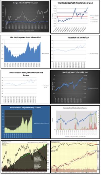
What has made the last few years of this particular bull market unique is that most of the data points or warning signs that have been helpful in pinpointing market turning points in the past haven’t worked this time. One could argue that all of these things just mysteriously broke and don’t matter anymore, but our opinion is that they have simply been drowned out by the unprecedented levels of government and central bank intervention throughout this bull market. The amount of money flowing into assets and driving prices up has never been matched. Our takeaway? This has distorted the price discovery process and created the illusion of safety in most asset markets. It is not the new normal, but rather a temporary condition. It creates the potential for much larger and more severe investment mistakes as it gives emotion more time to build and crowd out logic. Again, more on this later.
One indicator we monitor is how expensive a stock is relative to how much revenue the company is generating. This ratio is known as the “Price to Sales” ratio. You may be more familiar with a more commonly referenced ratio called the “Price to Earnings” ratio, but the “earnings” part of that equation is easily manipulated by routine accounting tricks. “Price to Sales” on the other hand is pretty straightforward: multiply a company’s outstanding shares of stock by its price per share to arrive at the company’s “market capitalization”, a concept we have highlighted within the past few months. Then divide that number by the company’s revenue. Dividing by revenue as opposed to “earnings” is a purer way to answer the question “How much “stuff” is the company selling relative to what the market thinks it’s worth?” For a stock to be cheap, this number should be low. The higher a stock price relative to its revenue, the more expensive it is, and the less an investor can expect to make in the long term.
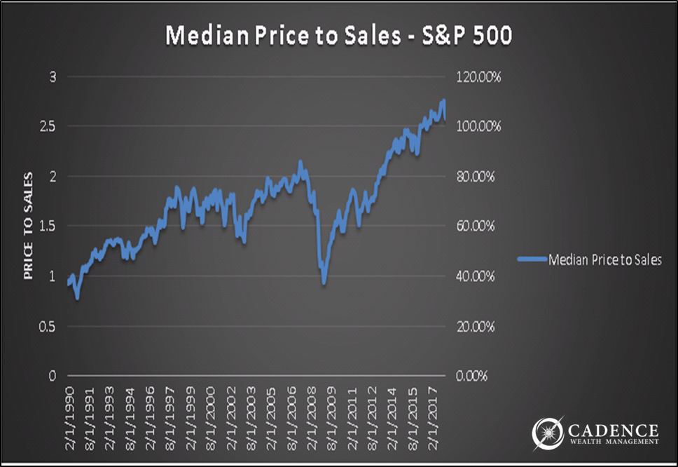
The chart above shows the Price to Sales ratio for the S&P 500 index over the past nearly 30 years, with one adjustment: instead of looking at the average price to sales figure for the index, which can be skewed by the results of the biggest companies in the index (see our August newsletter for information on just how much indexes can be affected by a handful of stocks), we are looking at what the middle stocks, the “median”, price to sales figures are.
This ratio entered frothy territory when over five years ago it passed the ratio’s valuation from right before the tech bubble burst in 2000. This ratio looked even more problematic when it surpassed the 2007 pre-Financial Meltdown levels a little over 3 years ago. Since then, the ratio has continued climbing upwards, 80% higher to be precise. Consider this one of those warning lights that would scream if it could. The only way this ratio comes down without the stock price falling is for the sales of the median S&P 500 company to go higher – much higher. Without that unlikely scenario happening, this ratio will eventually re-set itself by stock prices falling aggressively. Regardless of further market gains in the short term, investors will feel significant grief eventually as this process plays out – government manipulation notwithstanding.
And that is just one warning sign. On the first page we showed ten, but there are actually many, many more. The warning lights began flashing at different times, but the prevalence of them three years ago motivated us to take a much more cautious approach than we typically would. As those warning lights have only changed from yellow to orange to red, anyone who noticed the investment risks climbing back then will see they’re even higher today, so caution is undoubtedly still warranted.
How Bad Has It Gotten?
Since we urged investors to downshift a few years ago, the potential for loss in U.S. stocks has only grown. The chart on the following page shows the price of the S&P 500 corrected for inflation since the early 1870’s. The red line represents a point where investors looking at valuation and technical indicators would have grown quite concerned about market risks. The green line shows the long-term average return of the S&P 500.
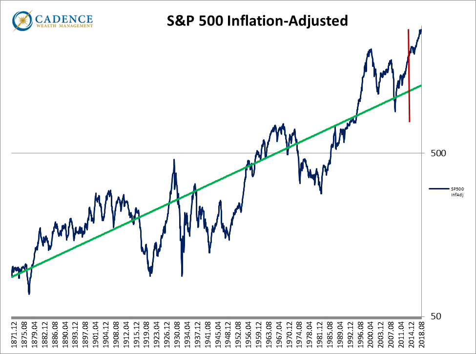
To answer the question “how much has the risk grown over the past few years?”, consider that more than three years ago, the S&P 500 would have had to fall around -40% to get back to its long-term average, which would be pretty painful. Since then, the inflation-adjusted price has only grown, and it’s now high enough where the S&P 500 would have to fall -55% to get to that long-term average, and keep in mind, it can fall below that level as it has many times in the past. Other indicators point to an even larger potential loss for the S&P 500.
Maybe increasing from a -40% loss to -55% loss doesn’t seem like all that much, but consider how much the S&P 500 would have to grow to get back to break-even were it to fall by each amount. With a -40% loss, the S&P 500 would have to increase by around 67%; with a -55% loss, that jumps to needing a 123% increase just to get back to break-even. That -15% difference nearly doubles the amount the investment would have to grow to break even. That’s the dangerous level this risk has grown to since those warning lights started blinking en masse.
It’s difficult to get conservative early only to watch the riskier allocation you left behind continue to perform well. Only through luck can someone pick a market’s exact turning point, so frequently investors looking to avoid large losses have to endure a few years of underperforming what they would have earned in order to avoid the large losses when they arrive. As painful as this may be, history has shown that investors who don’t heed the warnings can see gains for a few years and still end up worse off later on.
For example, in the two years leading up to the 2007 market peak, S&P 500 investors achieved a 31% cumulative return. On a $100,000 investment, that growth would have bumped it up to $131,000.
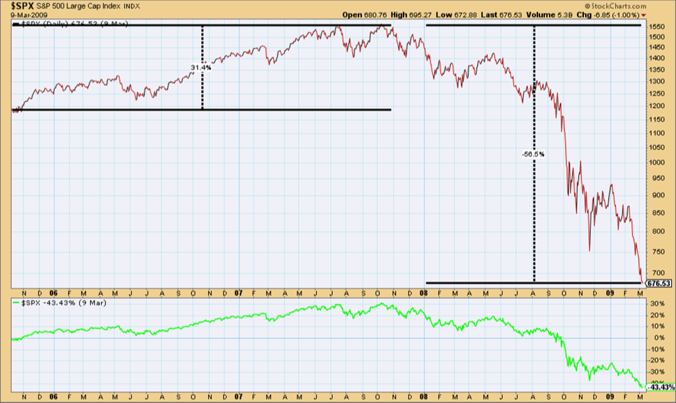
However, by staying in the market after that and riding the following bear market all the way down, those same investors would have watched their investment decline to $57,000. So even after growing by 31% for two years, the investment still lost -43% off its starting value. It’s hard to argue that the final couple years of stellar returns were worth the following loss.
That is by no means an extreme example, just the most recent. To look at a more sobering one consider the two-year period leading up to the 1929 crash that saw a 100% increase in the S&P 500. It wasn’t the somewhat smooth ride investors enjoyed two years before the 2007 peak, but still one that ultimately doubled S&P 500 investors’ money, resulting in their $100,000 investment growing to around $200,000.
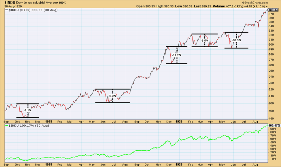
However, by the time the market peaked and the market cycle fully played itself out, that $200,000 would have been reduced to just $22,000 three short years later.
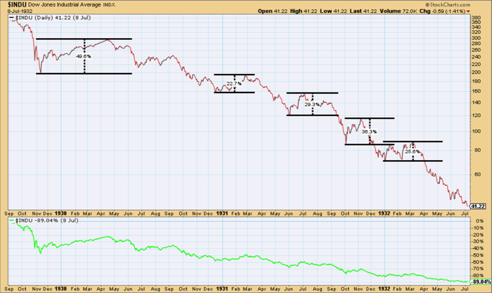
So after all that, the $100,000, which at one point had been worth around $200,000, ultimately ended up at just $22,000, a -78% loss off the initial investment EVEN AFTER THE INITIAL INVESTMENT HAD DOUBLED! This is a crucial point to remember; investments can grow over a period of years toward the end of a bull market and still be down by a wide margin after the subsequent bear market fully plays itself out. And if you think it’s easy to know when to get out of a crashing market, look at some of our past pieces, like September 2015’s “Anatomy of a Meltdown”, to understand just how hard it is to know whether the -10% loss is going to turn into a -20% loss which will turn into a -40% loss, or instead if the market will rebound after that -10% or -20% loss. If the plan is to sell after a scary loss of value happens, well, one would have done that years ago already. If instead one chooses to get back into markets after they rebound, then he or she would have sold out, locked in losses, then gotten back in at higher levels numerous times over the last few years. This process in many cases leads to losses rather than market gains. The bottom line is that if we determine the price of something is too high (which means risk of eventual loss is intolerably high relative to our goals and timeframes), we have to minimize exposure to it and look away. Whatever it does over the short or medium term doesn’t matter. It’s irrelevant.
Our research, and many other advisors’ and institutions’ research, shows that very rarely do people fail to achieve their goals by missing out on late inning market gains. Instead, it’s the large losses that derail people on the path toward goal-achievement. In the end, the price at which you buy a security, be it a stock, a bond, or something else, matters most.
Dangers were present three to four years ago. They’re worse now. Conditions like these can continue for longer than we’d think leading cautious investors to feel like they are missing out on returns. Don’t feel this way. It’s an emotional response and one that there isn’t a reasonable course of action for. If markets were too risky to load up on a few years ago, then doing so now shouldn’t even be a consideration. Hindsight bias will do us no favors here. History has shown, as we’ve highlighted, that being early to reduce exposure to excessively-priced markets is usually the best course of action – despite how uncomfortable it can feel. The great American financier Bernard Baruch was known to have said, “I made my money by selling too soon.” It may also be comforting to know he also advised us to “never follow the crowd.” If you’re investing in asset classes that are attractively priced, you are not following the crowd – You are following price. Logic. A rational course of action.