The month of July has seen the broad U.S. stock indexes such as the S&P 500, Dow Jones Industrial Average, and Nasdaq achieve new highs – which of course is a good thing for those with meaningful exposure to them. On the surface it appears that the party is still in full swing. We don’t have to go back very far however for a reminder of how quickly things can go bad and how uncomfortable it can be when losses start to pile up quickly. The fourth quarter of last year saw stocks sink almost 20% while May of this year saw them drop almost 7%. As they say in the industry, “risk happens fast”, which of course means that losses can accumulate very quickly when risks materialize. New highs notwithstanding, the risks associated with stocks are still present and are probably greater than they’ve ever been.
Before diving into some charts that support our view of underlying weakness within the stock market, we should provide some quick context of bigger picture issues. First, as we’ve discussed at length over the months and years, stock valuations are at extremes. Although valuations can’t help us pinpoint market direction over the short to medium term since expensive things can get even more expensive and cheap assets can get even cheaper, they do help us understand the return potential of an asset over a long period of time. Since future long-term returns are determined by the price we pay today, it’s fair to say that stock returns over a 10 to 15-year period are likely to be amongst the worst in history. This sets the stage for an increased possibility of large losses that an investor may not be able to recover from – an elevated level of risk.
Second, since we know that stock prices tend to be correlated with the business cycle, the risk of a stock market downturn goes up if the business cycle is turning down – which it currently is. Whether we’re looking at various industrial data sets, manufacturing, business sales, or GDP itself, the theme across most leading to coincident economic indicators is “slowing”. This points to an even greater intermediate-term risk to stocks barring any type of broad central bank or government intervention – and although this can’t be ruled out, it doesn’t necessarily mean that markets will continue higher. It’s worth noting that the Federal Reserve cut rates aggressively from 2001-2002 as well as in 2007-2008 and stocks went lower anyway. In short, the economic cycle is slowing here in the U.S. and is slowing much more aggressively in a host of countries overseas. This is not a safe backdrop against which to take stock market risk.
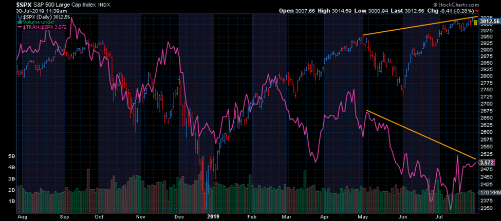
With those things in mind, we now need to turn to the inside of the stock market or “internals” for a look at what markets themselves might be suggesting. The first chart (and we won’t introduce them all from this point on since there are many) gives us a glimpse of how the transportation sector has performed relative to the broad market. You can see quite clearly that although stocks more broadly have been rising, the transports have been underperforming as noted by the decline in the pink line on the chart. It’s thought by many that the transportation sector can be a leading indicator or at the very least a confirming indicator for the rest of the market. Needless to say, it’s not confirming the uptrend in stocks.
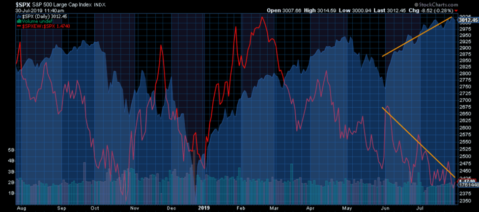
When we look beyond the largest companies in the S&P 500, we can see that the rest of them aren’t rising nearly as fast. The ratio of the Equal Weight S&P 500 to the Market Cap Weighted S&P 500 (where the largest companies carry more weight) trending lower suggests that the large companies are doing most of the heavy lifting.
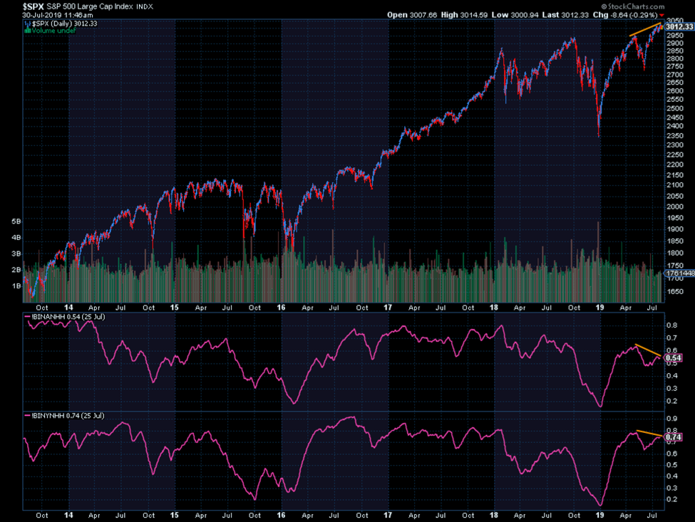
When we look at how many stocks in the Nasdaq and New York Stock Exchange are setting new highs in price we see more evidence of internal weakness. You’ll notice that although the S&P 500 index is now higher than it was in April, the number of stocks setting new price highs on the two aforementioned indexes have declined since April. This is a clue that fewer stocks are participating in the uptrend, which gives it less credence.
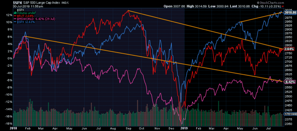
Next, and this one really calls out why we cringe every time we read a financial media headline broadcasting stocks making new all-time highs, we can see that not all stock market indexes are at new highs. Although the S&P 500 (blue) is, small cap stocks per the Russell 2000 index and international stocks via the MSCI World ex-US index are not only well off their highs set months ago, but in technical downtrends. Importantly, international stocks saw their peak in January 2018, or 18 months ago.
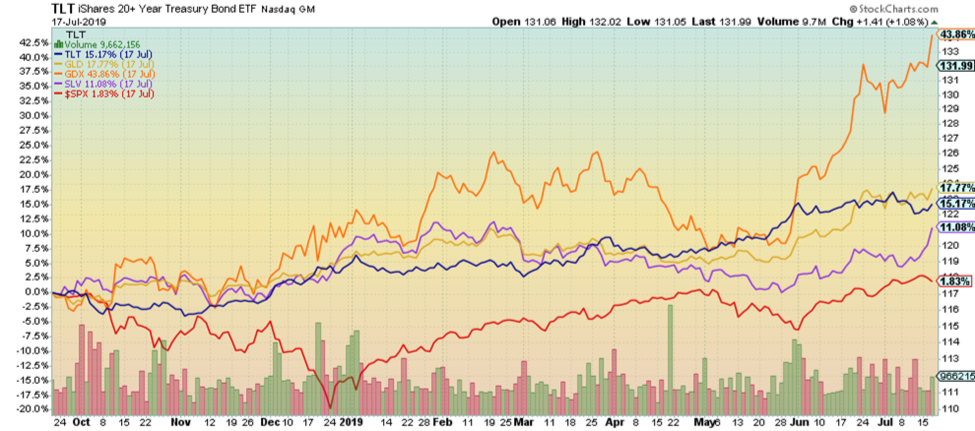
We’ve covered the fact that we’re lacking uniformity across the whole stock market with respect to the upswing this year, but what about other asset classes? Are there signs of money leaving stocks for safer categories or just plain better opportunities? That’s what we’re seeing, yes. Since the last stock market peak in September 2018 (the true peak for small cap stocks), the more defensive categories of gold, silver, precious metals mining stocks, and U.S. government bonds have all outperformed the S&P 500 by a fairly wide margin. This indicates that while most are debating the short-term fate of stocks, others may have already started shifting their money elsewhere.
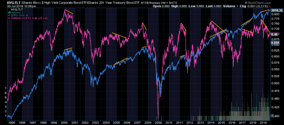
When we look at the bond market, there’s been a clear shift away from high yield/junk bonds in favor of the highest quality bonds out there – U.S. government bonds. Below we can see evidence of this through a ratio of junk bonds to government bonds. Note how this ratio has tended to slope downward prior to stock market peaks. It’s aptly said by some that when the stock and bond markets disagree, it often pays to listen to the bond market.
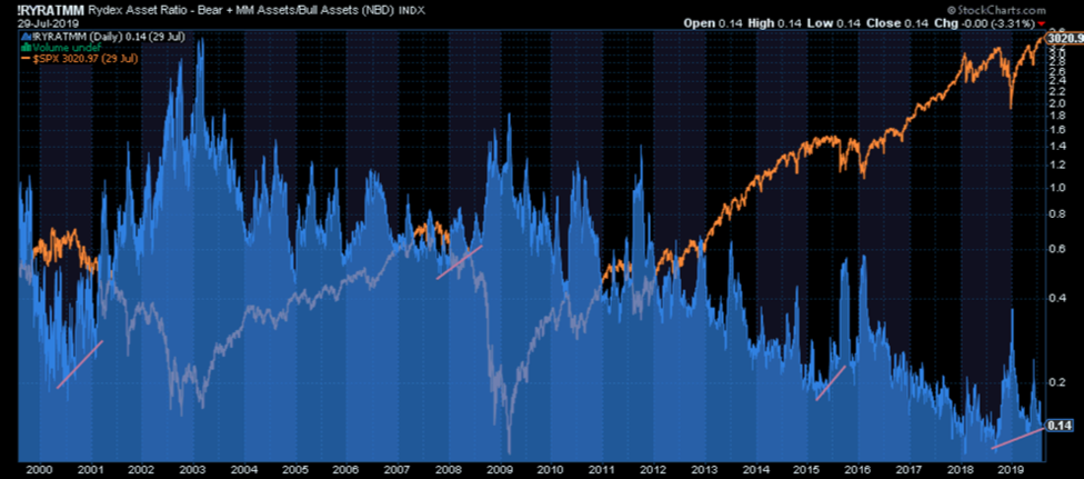
Finally, and this is important, we have to look at sentiment. Sentiment can help us identify the amount of momentum behind a potential shift, especially when it’s paired with debt or leverage. There are a number of ways to measure and map this, but one of them that we feel highlights the potential severity of the next down cycle in stocks is the Rydex ratio of Bear (bets against stocks) funds plus money market funds divided by total Bull funds (bets for stocks rising). If this ratio is low, it indicates more bullish sentiment amongst investors whereas if it’s higher, it indicates a healthy amount of pessimism or outright fear. The chart below clearly shows that investors in Rydex funds are more bullish – or put another way, more complacent – than they were prior to either of the last two downturns. This represents a huge amount of potential energy that could swing in the other direction over the course of the next bear market. Add to this sentiment ratio the amount of debt/leverage in the system and it’s even more sobering. What’s more is that it appears investors have already started to shift their bets when looking at this ratio over the last few months – they seem to be less bullish or complacent than they were a few months ago. It’s subtle, but like the other market signals we’ve discussed, it seems to point to a change in investor preference already in progress.
Some markets are at all-time highs, true – but most aren’t. Further, there is an uncomfortable amount of divergences or disagreements within and across stock markets currently that doesn’t inspire confidence that this rally is running on all cylinders. In addition, credit and bond markets along with precious metals markets have outperformed stocks over the last 3 quarters which suggests investors are starting to head for greener pastures. Place this against the backdrop of a global economic slowdown and the most expensive stock market in history, supported by the most debt and leverage in history and you have one pretty lousy risk/return profile. For those wanting to chase returns and who are comfortable with a 20 to 30-year investment time horizon to help heal deep stock market losses, by all means, take the plunge. For everyone else, we’d suggest it remains wise to focus on managing what could be the largest amount of risk stocks have ever faced.
The good news, as we’ve talked about in person with our clients and in these letters, is that there are alternatives that offer a much better risk/reward profile. Eschewing stock market risk doesn’t have to mean giving up on return potential. Quite the contrary. It’s just a matter of being early to the next party and waiting for the room to fill up. After all, despite the fact that there’s still loud music coming from the stock market party, we know it’s just a matter of time before somebody gets hurt, the police show up, and the music abruptly stops.