There are two environments where it’s most difficult for us as investors to keep our emotions in check and stick to our gameplan. First, when markets are falling and we’re fighting the urge to sell out at the worst possible time, and second, like right now, when markets seem to be moving relentlessly higher and we’re compelled to chase them. Of course, the important question is whether we’re in an environment that’s friend or foe to those markets we’re tempted to chase since the former would justify the risk-taking while the latter would eventually punish it. As always, the best way to keep emotion in the back seat is to have a numbers-based, data-driven process that informs one’s decision-making. In applying our process at Cadence, what we’re seeing is an environment that will most likely lead to regret for investors who give in to that “fear of missing out” (FOMO). Here’s a brief summary as to why.
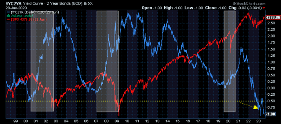
From a macroeconomic perspective, despite the stock market rally over the last 9 months or so, we are still in a horrible interest rate environment for credit availability, financial liquidity, economic growth, and by extension, financial markets. Below is a chart of the 10/2 yield curve (difference between the interest rate on the 10-year U.S. government bond and the 2-year government bond) showing that long-term interest rates are the most inverted relative to short-term rates as they have been in more than 25 years. An inverted or negative yield curve is typically seen in the early parts of an economic downturn, not at the end. As you can see, before the economy and markets can begin to strengthen again, the curve has to return to a more positive position. We’re nowhere close to that yet. The lifeblood for economic growth and financial markets, a positive credit and lending environment, remains broken.
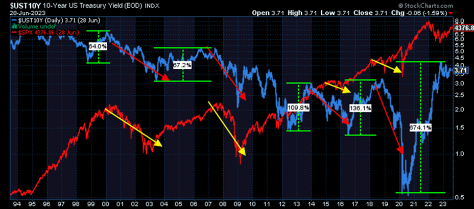
Similarly, when looking at the overall level of interest rates, in this case on the 10-year U.S. government bond, we can see that markets tend to get into trouble, in most cases full-fledged bear markets, after rates have risen persistently. This makes some sense as higher rates make it increasingly difficult for borrowers to both carry debt and spend as they did before taking on that debt. In addition, markets tend not to recover and get back on track until rates have fallen sufficiently from those higher levels. Notice two things from the right-hand side of the chart below, which is what we’re experiencing now. First, the increase in rates on a percentage basis over the last two years is unlike any in recent history in that it’s truly off the charts. This means that consumers will experience dramatically higher borrowing costs going forward compared to what they have become accustomed to. This will take time impacting the economy as old debt is rolled over and new purchases are made. Second, rates haven’t even begun to fall yet, which indicates to us that the headwinds facing the economy and financial markets are absolutely still in place. In terms of the larger “macroeconomic” picture, we’re nowhere near out of the woods.
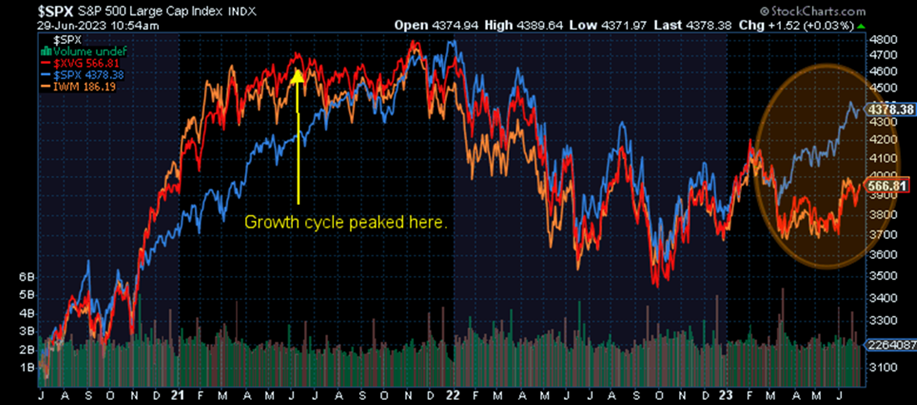
However, sometimes the stock market can signal improvements before the economic data does (although this typically doesn’t happen with respect to a deeply inverted yield curve), so we also need to look for signs of broad strength there before entertaining the thought that the worst is behind us. Unfortunately, when we do that, we see evidence of very narrow strength and broad weakness. Below is a chart showing the S&P 500 in blue, the Russell 2000 small cap index in orange, and the Value Line Geometric Index, an equal market cap weighted index of North American stocks, in red. What you can see is that although the S&P 500 is making new short-term highs, the other two equal-weighted indexes are not. They are still clearly well below their prior highs from earlier this year. The reason for this is because the 5-10 largest companies in the S&P 500 drive the vast majority of the performance within the index. If the index were computed based on the other 490 stocks, it would look much more similar to the Russell and Value Line indexes. The same goes for the tech-heavy Nasdaq index. Thus, the vast majority of the stock market is very much behaving as it should be, as though we’re still in a very unfriendly bear market environment for stocks and other economically sensitive risk assets.
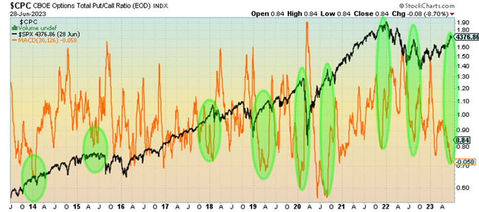
So, given the above, our bias is for stocks to turn lower at some point and potentially significantly so. Of course, the timing of that is always difficult, but there are two points to consider here. First, if we’re in a bear market, rallies tend to be limited in terms of scope. Although they can be large in magnitude (some of the biggest upswings tend to happen in bear markets), they tend to be fairly short-lived. Second, we need to look at different sentiment indicators to help us evaluate whether the rally might be near its end. Sentiment can be tricky, however, since it’s debatable whether it leads markets or markets lead it, which is why we prefer looking at the options market behavior rather than other forms of sentiment that measure feelings as opposed to action. When we look at put and call activity in options markets (below), what we see is an extreme amount of activity in calls, which represents bullish or risk-taking behavior. The green highlights show times when this activity reached extreme levels over the last few years and the subsequent stock market activity (black). What’s clear is that when options market activity reaches extreme levels, the market oftentimes will cease moving in that direction and turn the other way.
As such, we would be on alert based on what we’re seeing in the options markets for an upcoming decline in stocks. Again, based on the weight of evidence we’re seeing from weak macroeconomic data to thin market participation, we would be prepared for a rather large one. We don’t see any evidence of a nascent bull market at the moment. Quite the contrary. Stay patient with those portfolio positions that tend to protect best given this reality.
Editor’s Note: This article was originally published in the July 2023 edition of our “Cadence Clips” newsletter.
Important Disclosures
This blog is provided for informational purposes and is not to be considered investment advice or a solicitation to buy or sell securities. Cadence Wealth Management, LLC, a registered investment advisor, may only provide advice after entering into an advisory agreement and obtaining all relevant information from a client. The investment strategies mentioned here may not be suitable for everyone. Each investor needs to review an investment strategy for his or her own particular situation before making any investment decision.
Past performance is not indicative of future results. It is not possible to invest directly in an index. Index performance does not reflect charges and expenses and is not based on actual advisory client assets. Index performance does include the reinvestment of dividends and other distributions
The views expressed in the referenced materials are subject to change based on market and other conditions. These documents may contain certain statements that may be deemed forward‐looking statements. Please note that any such statements are not guarantees of any future performance and actual results or developments may differ materially from those projected. Any projections, market outlooks, or estimates are based upon certain assumptions and should not be construed as indicative of actual events that will occur. Data contained herein from third party providers is obtained from what are considered reliable sources. However, its accuracy, completeness or reliability cannot be guaranteed.
Examples provided are for illustrative purposes only and not intended to be reflective of results you can expect to achieve.