There’s an old business axiom “You Are What You Measure” and when it comes to investing, there is no shortage of things to measure: returns, risk, alpha, beta, tracking error, and so on. Each has its purpose. Measuring investment performance is frequently a two-part process comprised of measuring returns over a designated time period, and then comparing that performance to something. The first part determines your absolute performance, and the second part determines your relative performance; the first part tells you what you did, the second part tells you if it’s good or bad relative to something else.
That second part depends very much on what you are comparing your performance to. If you own a stock and it is up 15%, that’s good, right? We like 15%. But if the overall stock market is up 30%, that 15% doesn’t look quite as good. So when it comes to whether or not you are doing well, it depends to what you are comparing the performance.
In most cases, investors compare their performance to an index or a set of indexes like the Dow Jones Industrial Average (DJIA), the Standard & Poor’s 500 Index (S&P 500), and the Nasdaq Composite (Nasdaq). The values of these indexes, and their changes over time, are widely reported in the media multiple times a day, every trading day of the year. But what are these indexes, and what determines their performance?
The Dow Jones Industrial Average
The Dow Jones Industrial Average was first compiled on May 26, 1896, is the second oldest stock market index, and probably the most widely quoted. It measures the sum of one share of stock of each of the 30 companies in the index, corrected for certain factors. These 30 companies are all large, well-known American companies. How large? Of the estimated $30 Trillion in publicly traded American stock which is considered “The Market”, these 30 companies represent 23% of that total. So when the Dow is positive during a trading day, that means at least 23% of the total US stock market is also positive.
However, despite the Dow’s popularity among sources quoting market indexes, it is not as good at representing market moves as others for a couple key reasons.
The first is that even though it represents 23% of the total market, there are other indexes that represent more. We’ll get to one in a moment. The second reason is since the DJIA is comprised of 1 share of stock from each of its 30 companies, those companies with higher stock prices affect how the index moves more than those with lower stock prices, regardless of how large those companies actually are. Higher stock prices do not necessarily, quite frequently in fact, indicate how large a company actually is. The size of a company is called its “market capitalization” or “market cap”, and it is calculated by multiplying its stock price by the total number of shares outstanding. Therefore, even with a high price per share, a company may not be as large as one with a lower price per share if the lower price per share company has a larger number of outstanding shares.
Both Boeing and Apple are in the Dow Jones Industrial Average. Boeing’s price per share at the time of this writing is $356; Apple’s is $195. Based on how the Dow is constructed, this means Apple has just a little over 50% of the influence over the Dow as Boeing, even though Apple is around 350% more valuable based on its market cap. Boeing’s price per share may be higher, but Apple is the bigger company. Regardless, Boeing has more influence over how the Dow index behaves.
For these two reasons, only 30 companies and the fact that the index is weighted based on the prices of each company in the index, the Dow is an antiquated way to look at what the stock market is doing.
The Standard & Poors 500 Index
The S&P 500 index as currently constituted was first compiled in 1957. A committee decides which companies are in the index based on a set of criteria, and they add and subtract between 10 and 40 companies each year. These 500 US companies (fun fact: it’s currently actually 505 companies) represent a much larger percentage of the total US stock market than the DJIA, as the S&P 500 represents roughly 80% of the ~$30 Trillion stock market. Also unlike the Dow, whose company weightings are based on the price of their shares, the S&P 500 weights companies according to their size based on market capitalization. Using the previous example, in the case of the S&P 500, Apple has around 350% more influence over the S&P 500 than Boeing because Apple’s market capitalization, its “size”, is 350% larger than Boeing’s.
Because the S&P 500 is size-weighted as opposed to price-weighted, and because it represents around 80% of the total US stock market (remember: the DJIA is at 23%), it is widely regarded as one of the best indicators of what the US stock market is doing. Though the companies in the S&P have to be “American”, on average they derive at least 40% of their sales from foreign countries.
The Nasdaq Composite Index
The Nasdaq Composite was launched on February 5th, 1971 and is based on the 3,300+ equities traded on the Nasdaq exchange. The Nasdaq exchange was the first exchange that executed orders via computer as opposed to people, and has traditionally attracted a high percentage of technology-oriented companies. As such, the Nasdaq Composite Index is a proxy for how technology company stocks are performing. Nasdaq companies do not have to be US-based companies, unlike those in the DJIA and S&P 500.
The Nasdaq Composite is composed of companies whose aggregate market capitalization totals $11 Trillion, which makes it larger than the DJIA but smaller than the S&P 500, though again, some of that market capitalization comes from stocks of foreign companies. Like the S&P 500, companies are weighted in the Nasdaq Composite based on their market cap, or “size”, and therefore Apple, which is in all three indexes, has a much larger effect on the movement of the Nasdaq than the other two indexes because it constitutes about 4% of the S&P 500, 5% of the DJIA, but nearly 10% of the Nasdaq.
There are thousands of indexes, some covering stocks, some covering bonds, some covering just about anything you can imagine as long as it is a security that can be bought and sold. If this article were to stop at this point, we hope you would walk away with a better understanding of what these indexes are when they’re reported in the media. The DJIA is not the best indicator of what the US stock market is up to yet seems to be reported on more than the others because it always has been; it’s easy for people. The S&P 500 on the other hand is a much better indicator of what US stocks are up to, especially large ones. The Nasdaq Composite, with nearly half its exposure to technology companies, is a good, but not perfect, indicator of what is happening to technology company stocks around the world.
Additionally, we would hope you see the difficulty investors have comparing the performance of their investments to these or any one index as opposed to a basket of indexes that better matches their own allocation. It’s very easy to compare how your investments are doing relative to the Dow Jones Industrial Average, for example, because it is quoted multiple times per day on many news sources. However, that’s like comparing a red delicious apple (DJIA) to a fruit salad (your allocation) that only contains a bit of red delicious apple and therefore distorts your perception of your own performance.
This article is not ending here, however, as looking at the composition of the indexes, how they are performing, and comparing their composition and performance to other factors can give us clues as to where stock prices are headed.
What Might the S&P 500’s Performance and Composition Tell Us About The Future?
Because the S&P 500 is “Market-Cap Weighted”, which is short for “the largest companies have the biggest influence over the index”, the price changes of just a handful of companies can have an over-sized impact on how the index behaves. Just how distorted is the influence of a handful of companies, you may ask? Consider the following chart. What it shows is that the top 5 largest companies in the S&P 500, Apple, Amazon, Alphabet (Google), Microsoft, and Facebook have as much influence over the upward and downward moves of the S&P 500 as the BOTTOM 288 COMPANIES in the index.
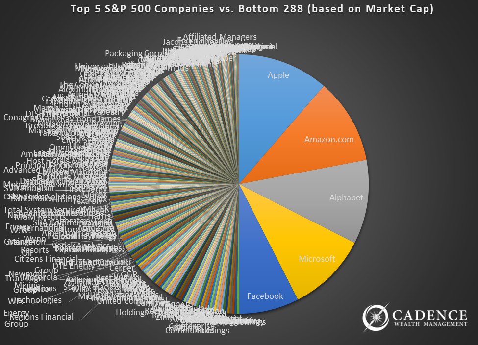
No, the pie chart doesn’t need a shave on the left side, those are 288 company names that are all mashed together to label that half of the chart, while just 5 companies complete the other half. What this means is that the index can be easily moved up or down by the stock performance of just 5 companies.
If we were going to blow this out a bit, we could show you how just the top 10 S&P 500 companies represent as much of the index as the bottom 348. We have that chart too; you know we do! Just 10 companies control about 40% of how this 500 company index performs. Sometimes that’s a good thing for people investing in the index, and sometimes it is not.
What the undue influence of just 5 or 10 companies does is to distort the view of the health of the overall stock market. If only these companies’ stock prices are doing poorly, it can look like the overall stock market is. Likewise, when only these companies’ stock prices are doing well, it can look like the overall stock market is too.
And that is actually where we find ourselves today. As of the time of this writing, the S&P 500 is up a little over 6% on the year. Were you to take away the top handful of companies, however, the index would actually be just about at break-even. Just five companies contributed 25% of the S&P 500’s growth in 2017. This over-sized influence becomes concerning to investors for two reasons.
The first, of course, is that if just a handful of companies do poorly and investors have over-sized exposures to them, their investment performances will suffer while potentially the broad market itself performs well. The more concerning reason, however, is not so much what these handful of companies do to our performance so much as how they lull us into believing the overall market is healthy.
When a handful of big company stocks do well while the vast majority perform relatively poorly, it hints at a market that is ready to peak or already has. The normal business cycle sees the biggest of the big companies’ stock prices outperforming at the later stages of bull markets. What we’re now seeing is the biggest of the biggest of the big carrying the day. What we’re also seeing is hundreds of other stocks with declining revenues, shrinking markets, and tired stock prices.
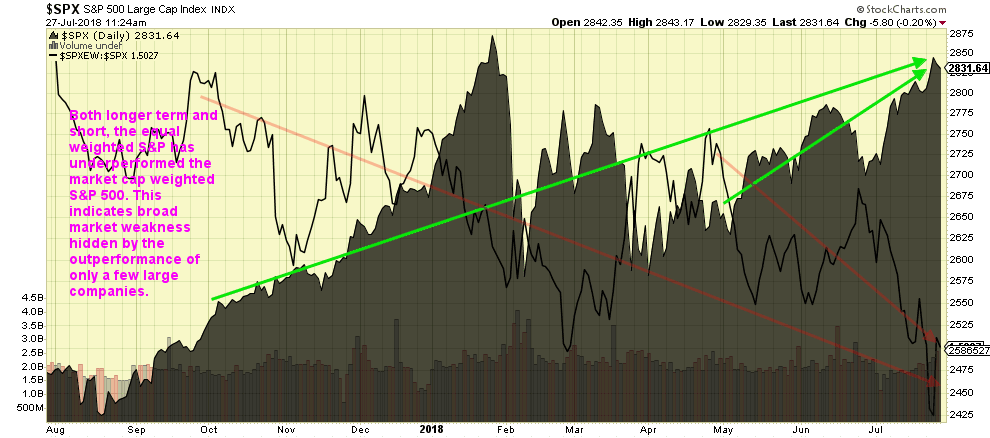
One way we can illustrate this is to look at the performance of the S&P 500 were all 500 companies to have equal influence over the index, what is known as “equal weighting”. What we typically find late in bull markets is that the equally weighted index begins to underperform the regular index. What this means is that the majority of the companies in the index actually aren’t doing as well as you would think by just looking at the size-weighted index.
In the graph on the following page, the equally-weighted S&P 500 index is represented by the single black line—a ratio that shows us most clearly how the equally-weighted index is performing compared to the standard size-weighted index. Over the past year, the value of the equally weighted index has actually been falling, as noted by the long orange line angling from the top left to the bottom right. That loss has accelerated since it recovered a bit in May, as illustrated by the shorter orange line that is a bit difficult to see. The size-weighted/standard S&P 500 index, on the other hand, noted here by the line with the solid shading underneath, has seen gains over the past year, as noted by the long green line going from the lower left to the upper right. These gains have accelerated since May as noted by the shorter green line.
What might happen next as a result of this divergence? As we can see from the graph below, the broad market in 2007 began to weaken shortly before the ultimate market peak in the standard S&P 500 index later in the year. This is again represented by the thin black line below. The weakening started in the period highlighted by the red oval. You can see the single black line falling. This weakness was masked by the market cap weighted indexes, here represented by the line with the shading underneath it. For those watching the “whole” market, there were clues that all was not right.
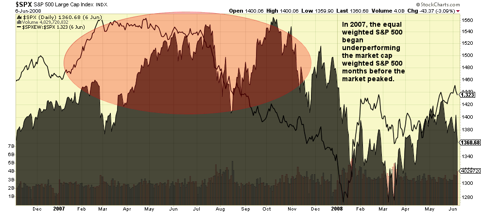
While the normal S&P 500 index seems to point to continued good times, the majority of the stocks in the index are actually telling a different story (first graph above). Unfortunately this pattern is common in the later stages of stock market rallies, and all it will take is for the large companies to perform poorly and the market could completely turn over (second graph above).
Although the top 5 S&P 500 companies represent such a large percentage of the index’s overall total, that percentage is not as high as in some past periods. That’s the good news. The concerning news is that the total is actually increasing, and the times in the past where the top stocks represented a higher total preceded market losses. Over at the Nasdaq, the top five have never constituted as much of the index as they do today.
Armed with an understanding of how the major stock indexes work, we can not only make better performance comparisons with our own portfolios, but also set better expectations around the performances we should be, and in the near future might be, receiving. If we have properly diversified our investments, we are better served comparing our performance to something that better mirrors the composition of our total portfolio.
In addition, we should also take note of the fact that these market indexes’ performances are being buoyed by a few larger stocks. Historically this has not led to positive outcomes for too long. As we write this, Facebook is posting the largest single day stock market loss in history at over $100 billion. The S&P 500, with Facebook as its fifth biggest component, is negative a bit. The Nasdaq, where Facebook is an even bigger component, is down over -1% and falling. The Dow, which doesn’t have any Facebook exposure, is up nearly half a percent. To understand both your own investment performance and where the market might be headed, it pays to understand the indexes.