“The stock market is not the economy.” Maybe you’ve heard this before, as any time the economy seems to be struggling but the stock market isn’t we are reminded that these two things are not synonymous. However, they are related to enough of an extent where when one is doing well or poorly, we generally expect the other to follow suit. It’s practically guaranteed that the stock market will rebound before the economy does during recessions, but how long can company stocks outperform the economies in which they exist, and what could the consequences look like?
To understand why the economy and the stock market perform differently from time to time, it’s useful to remind ourselves what each really is. There are many ways to describe what an “economy” is, but we feel a useful way to look at an economy is as a large set of inter-related activities that determine how resources are distributed. One extreme form of this would be a system where felt-clad workers loaded crops onto nondescript government vehicles for distribution to the population with no money ever changing hands. In this economic system no companies are involved whatsoever, but there is still an economy, albeit not a very entertaining one and not one that promises much in the way of upward mobility.
Technically, a stock market is actually the place where entities buy and sell shares of stock, like a farmers market for financial securities. However, when we refer to the “stock market” we are almost always referring to the stocks themselves, such that when we say the “stock market has lost value” we mean the stocks themselves have lost value, not the place in which they are bought and sold. A useful way to represent the value of various parts of a stock market, or the stock market as a whole, is by using stock market indexes. For example, the S&P 500 index is a market capitalization-weighted representation of the 500 largest publicly traded companies in the U.S. Of all the stocks that make up the $36+ Trillion publicly traded stocks in the US, the S&P 500 encompasses over 75% of that total. From here on out, when we mention “the stock market”, we mean an index that represents the performance of stocks within the overall stock market. For a deeper dive on stock market indexes, refer back to our August 2018 newsletter: “It Pays to Understand the Indexes”.
How do individual companies as well as groups of companies that represent stock markets and indexes relate to the economy? In a mostly capitalist system like ours, public and private companies are responsible for much of the creating and distributing of the goods and services inside the economy. Consider an economy being a fish tank and companies are fish swimming around in that tank, along with the water, plants, little scuba diver guys and bubbling treasure chests, what have you. If the tank is an economy and individual fish are companies, you can consider a school of related fish as a stock market index. Stock market indexes are affected by the other things in the tank, as well as affect the other things in the tank themselves, hence an economy is an “inter-related” system. The healthier, more vibrant and larger the fish tank is, the more opportunities there are for fish to thrive in the system, allowing fish to grow larger and more abundant.
So though the economy and the stock market are not the same thing, they are most definitely related and most definitely affect each other, but what happens when a school of fish seems to be growing too large for the tank? What happens when the value of the stock market seems to be getting over-valued relative to the size of the economy?
Let’s assume that the aggregate value of stock markets and the economies in which the companies exist should grow roughly at about the same rate over the long term. There will be years that stock prices decline much more than the economy shrinks, and we know stock prices increase a lot faster than the economy expands at times. However, over time we can assume the schools of fish are constrained from growing by the size and health of the tank. The chart below shows the growth of the US economy as measured by Gross Domestic Product in nominal (not corrected for inflation) terms, as well as the growth of the S&P 500 price plus annual dividends since 1944:
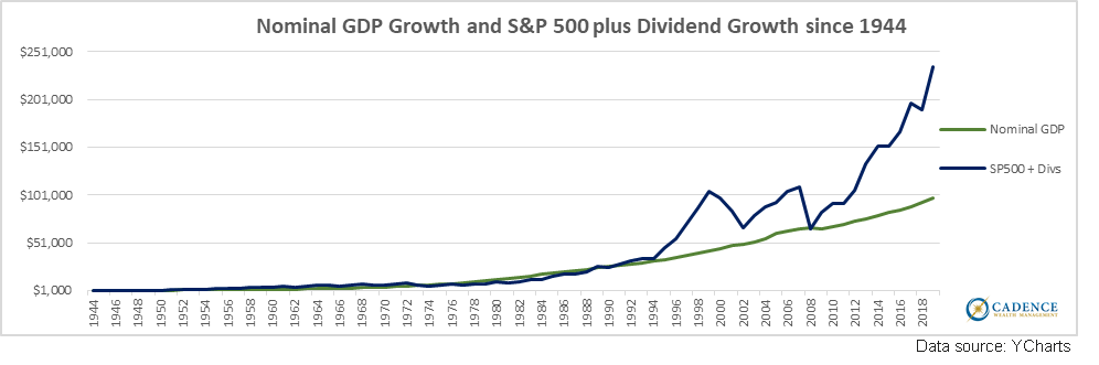
The growth of each was relatively similar for the first 50 years since the end of 1944, with GDP growing around 7.2% per year and the S&P 500 plus dividend value growing around 7.3% per year. However, a noticeable divergence started in the late 90’s with the Tech Bubble inflating stock price growth, followed by the real estate bubble doing likewise during the mid-late 2000’s, until the Great Recession dropped stock price growth once again in line with the size of the fish tank. However, since that point US GDP has grown at a slower 3.5% while the price of the S&P 500 plus its dividends has grown by 12.3% per year.
We can see there’s been a divergence in growth rates between the economy and the stock market since the mid-90’s, with a very meaningful acceleration of S&P 500 price and dividend growth relative to GDP growth since New Year’s Eve 2008, but growth rate and size are two different measurements. We can see the fish are growing faster than the tank, but how do we know when they’ve possibly gotten too big? After all, maybe there was a lot of room for the value of companies to grow relative to the size of the US economy.
The way for us to gauge whether or not the S&P 500’s total value, and by extension the stock prices that comprise that index, has grown too large relative to the size of the economy is to compare their values over time. We do this by dividing the total value of the S&P 500 as measured by market capitalization, or “Market Cap”, by the size of the economy as measured by GDP. The current Market Cap of the S&P 500 is around $27.1 Trillion. The current size of the US economy is roughly $21 Trillion. That gives us a ratio of about 1.28 S&P 500 Market Cap to GDP. Is that big? Is that small? What does that mean?
To answer that we’ll have to look at this ratio over time, and look for periods where it seems like that ratio is small and times where it is large. Consider that ratio since 1953, which is as far back as we can go to get meaningful data for this comparison:
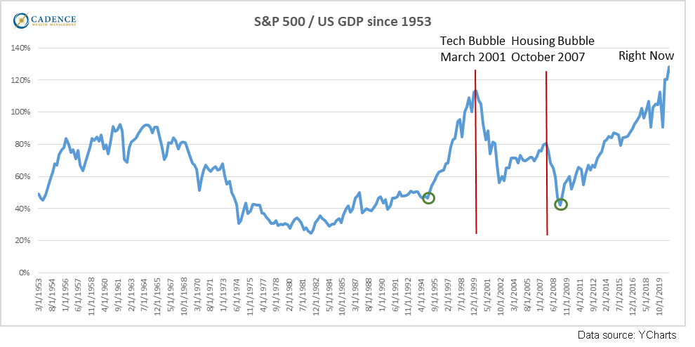
Per this measure, since 1953 the S&P 500 Market Cap has never been larger relative to the size of the US economy than it is right now. We have looked at this particular metric using a number of different stock market indexes: DOW/GDP, Wilshire 5000/GDP (the Wilshire 5000 index encompasses nearly 100% of publicly traded US companies versus the S&P 500’s 75%), and the Corporate Equities/GDP measure. They all tell the same story, with nearly identical charts – stocks look significantly overvalued relative to the size of the economy. Those are some really big fish swimming in the tank at the moment.
How much they are overvalued, or more importantly to us how much their values could fall the next time they sell off, is unknowable. We can, however, use various measures to approximate. For example, the two green circles in the chart above represent points in time where the S&P 500 price and dividend growth rate equaled the growth rate of GDP since 1944 as depicted in the first chart. These two green circles correspond to the blue and green lines touching in 1994 and again in 2008. In order for the S&P 500 plus dividends to “touch” the GDP line again right now, the S&P 500 would have to shed around 60% of its value.
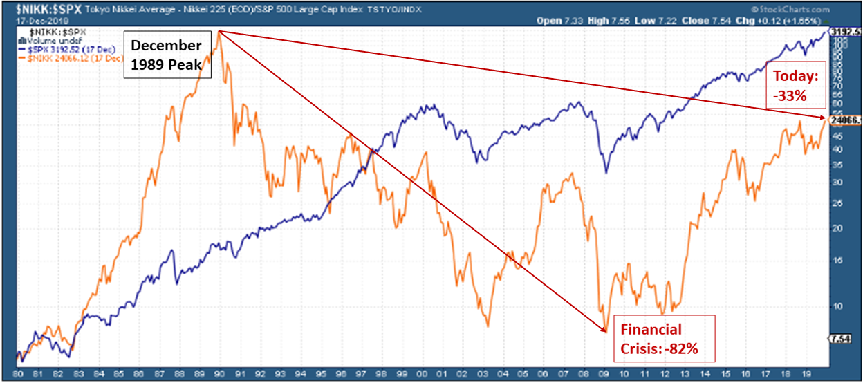
Despite any measurements we make, there is no way to know when and by how much stock prices will fall. If we want to see examples of other fish outgrowing their tanks and what the resulting stock market value changes were, then we can look to the Japanese stock market as measured by the Nikkei 225 average since 1980.
The Nikkei 225 grew in value exponentially through the 1980’s until it peaked on December 29th, 1989, nearly 31 years ago. From that point throughout the 1990’s and 2000’s, the Nikkei seesawed up and down, but mostly down, for decades, finally bottoming out in March of 2008 having lost nearly 82% of its value since peaking in late 1989. Like our stock market indexes, the Nikkei 225 has rebounded from that Great Recession low, but it still sits nearly 33% below its all-time peak more than three decades later. The chart on the following page shows the Nikkei’s and the S&P 500’s market fluctuations since 1983, with the Nikkei in gold and the S&P 500 in blue. As you can see, the Nikkei grew much faster than the S&P 500 did then or since, until it too was extremely overvalued relative to the Japanese economy. As you can see, it fell jaggedly for decades and has yet to climb back above its late 1989 peak.
Could our own stock market really do that though? Falling 60% is bad enough, but falling 82% and being below its peak for multiple decades? As we showed in our July 2017 newsletter piece “Could Multiple Decades of Zero Stock Market Growth Happen to You?”, the S&P 500 average has peaked six times since the early 1870’s, not including the current peak. Each of those six stock market peaks was followed by a crash, and then the market bottomed out and eventually increased back above the previous peak and never fell below it again. The average time it took to peak, crash, recover, and increase beyond the peak for good was 32 years. The three most recent US stock market crashes took less time to recover and permanently eclipse the previous peaks than the earlier crashes, however the average permanent recovery time after the three most recent peaks was still nearly 16 years. Corrected for inflation, the average recovery time for the three most recent peak-crash-eclipse periods was also, coincidentally enough, 32 years.
Unless immigration increases above its current rate, demographic trends point toward lower economic growth from smaller workforce participation. Combine that with the amount of debt that has been used to elevate stock price growth 12.5% per year since 2008 compared to the economy’s much more sluggish 3.5% nominal growth, plus many, many other structural factors, and at some point headwinds on the stock market may be great enough to impede its price growth for a long period of time. The analysis in this article does not mean that a 60% – 82% multiple decade stock market decline is definitely going to happen, but it does show that it could. After all, it has several times before now. Despite that grim possibility, and with an uncertain future in a period of high stock market valuations, there are still ways to invest for protection and growth as detailed in last month’s article “Taking Control”.
Like all stock market analyses and resulting conclusions, there are any number of counter arguments to these points. This article and our readers’ attention spans have their reasonable limits, so debating the finer points of the analysis will have to wait for another day, but consider this: the way the Federal Reserve and other central banks around the world have been throwing money into the financial markets the past decade in an effort to prevent deflation, the way some companies have been feeding off of low interest rates for growth as opposed to sales, and the way dollars have been burning holes in the pockets of affluent investors, well. . . how long can you shake the food container into the fish tank before something terrible happens?
Editors Note: This article was originally published in the December 2020 edition of our “Cadence Clips” newsletter.
Important Disclosures
This blog is provided for informational purposes and is not to be considered investment advice or a solicitation to buy or sell securities. Cadence Wealth Management, LLC, a registered investment advisor, may only provide advice after entering into an advisory agreement and obtaining all relevant information from a client. The investment strategies mentioned here may not be suitable for everyone. Each investor needs to review an investment strategy for his or her own particular situation before making any investment decision.
Past performance is not indicative of future results. It is not possible to invest directly in an index. Index performance does not reflect charges and expenses and is not based on actual advisory client assets. Index performance does include the reinvestment of dividends and other distributions
The views expressed in the referenced materials are subject to change based on market and other conditions. These documents may contain certain statements that may be deemed forward‐looking statements. Please note that any such statements are not guarantees of any future performance and actual results or developments may differ materially from those projected. Any projections, market outlooks, or estimates are based upon certain assumptions and should not be construed as indicative of actual events that will occur. Data contained herein from third party providers is obtained from what are considered reliable sources. However, its accuracy, completeness or reliability cannot be guaranteed.
Examples provided are for illustrative purposes only and not intended to be reflective of results you can expect to achieve.