If you read our letters fairly regularly, you’ve probably picked up on the fact that we like to question the conventional, especially when our observations don’t confirm it, and even more so when embedded conflicts and incentives provide support for that convention. Take for example the notion that stocks can somehow return double digits even though the economy is growing at a substantially slower rate. How is this possible? Don’t think and just accept, some might say. Thinking only delays your ability and dampens your enthusiasm to invest blindly in something that is good for the goose. And as we all know, what’s good for the goose…
Let’s brainstorm a bit on this, shall we? Because the answer is really important when it comes to investing for our future – critically important, in fact. We don’t have all the answers—nobody ever does. But we do have lots of questions and a genuine curiosity to understand how things really work. As we’ve written about before, rarely do we get answers that we’re 100% certain of, but we can get a general sense of things, oftentimes with a reasonably high probability of being correct, which is almost always enough. Waiting for certainty makes one indecisive. Being certain makes one foolish. So, how is it that stocks can go up at a faster rate than the general economy over a long period of time? To answer this question, we first need to simplify the picture some to eliminate the effect of noisy, inaccurate data.
Gross Domestic Product, the official measure of economic growth, can be problematic. First, it has four components – consumption, investment, government spending, and net exports. Within each of these categories, there are subcategories that are tracked in various ways – some of which are estimates that ultimately get revised to closer estimates. In addition, you could have a situation where a large portion of GDP comes from government sector spending being directed toward horribly inefficient purposes, which would not accurately reflect the true condition of the economy. Rather, the state of the banking system and its ability and willingness to extend credit might be a better way to assess economic growth. The economist Richard Werner, author of “Princes of the Yen”, has studied extensively the banks’ roles in “creating” money within the financial system through the extension of credit. Contrary to popular belief, Richard argues that it’s not the Fed that creates money, but the banking system. If banks are lending for productive purposes, then the economy can grow. The more money there is available in the system, the more growth can be achieved. This makes good intuitive and logical sense as we already know that the Fed can really only encourage member banks to lend by increasing their reserves, but can’t force them to. We also know that previous historical incidents of banks tightening credit or failing outright was never good, and sometimes led to dire economic outcomes. Think Great Depression. If banks are lending money into existence productively, at scale, there is growth. If they aren’t, there is stagnation—or worse. So, the growth in bank credit seems a logical proxy for economic growth.
The next step is to think about whether corporations should be growing faster than this growth in credit. At the individual company level, sure. There are always new innovations and products that sell like hotcakes for some period of time. However, at the index or market-wide level, it doesn’t make sense that companies, over long periods of time, would be able to grow profits faster than the supply of money is growing within the system. This might be possible over shorter periods of time through efficiencies, profit-margin improvements, salary reductions, right-sizing, etc., but eventually these tactics are exhausted and become counter-productive, resulting in poor product quality, poor customer service, and disenfranchised employees, for example.
So, it seems reasonable to think that the broad stock market should grow at roughly the same rate as the supply of money within the economy – over time. Speaking of money, it’s also helpful to think of what asset or currency is most reflective of that supply of money within the system. Governments with a proclivity to spend at perpetually increasing rates would have us believe that their respective fiat (paper) currencies are “money”, but as we are all well aware, those paper currencies lose value to inflation every year. Real money should not lose value. And that brings us to the one asset that has served as money for thousands of years that today’s central banks and sovereign governments around the world are gobbling up for just this purpose – gold. If bank credit creates money, and this money drives economic growth, then gold should roughly reflect that economic inflation over time.
The final distinction to make before looking at the data is that of total economic and asset inflation versus consumer or price inflation. The official CPI numbers that the government has put out for years have averaged anywhere from double digits in the 1970’s and 1980’s, down to 2% more recently. Inflation tends to average between 3% and 4% most years. However, similar to GDP, the complexity of the CPI calculation is laughable. In addition, there have been changes over the years to make inflation appear lower than it actually is. Most would strongly object to the official annual inflation rate of 2.7%, and argue that their spending has risen much quicker than that over the last year. Therefore, it’s reasonable to believe that true consumer price inflation actually runs much more closely to the economic rate of growth than most think. There’s no question that televisions and refrigerators cost less now than they used to. Price deflation through innovation and efficiency is real, but for each one of these items, we have medical insurance, steak, eggs, and other costs that seem to grow much more closely with the overall money supply, or put another way, the decline of our paper currency. If consumer inflation is closer to broad economic or monetary inflation, we should be able to see that through hard assets that serve as true money, and have for quite some time.
In looking at the historical data, we need to account for the fact that almost every Wall Street investment rule of thumb that most operate by today is based on the last forty years of market data. The reason is two-fold: First, financial markets awoke from their malaise in the early 1980’s and have since experienced some of the best returns in history, and second; this gave birth to the financial services industry as we know it today – the same players who benefit from investors being excited to invest. The result of this is effectively two financial market periods with two vastly distinct realities, the first of which is almost entirely forgotten, and the second period fueling most investment decisions being made today. Since no trends last forever, it’s our view that we absolutely must look at the first period for full perspective. We somewhat arbitrarily chose the period of 1900 to 1975 as the first, long-term period to look at, and 1975 to current as the second.
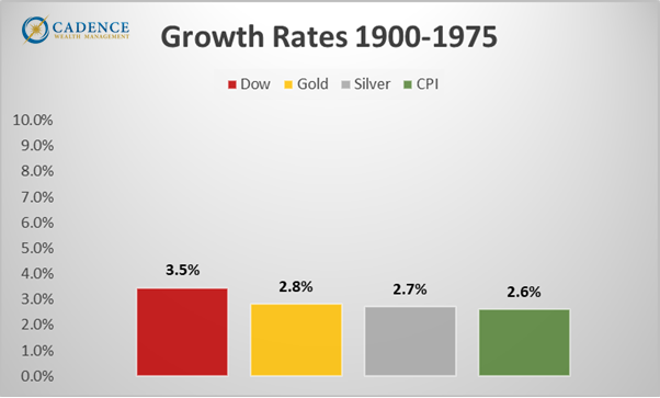
What we notice in looking at the 75 years since 1900 is that the Dow Jones stock market index rose at an annual rate of 3.5%, while gold, silver, and the CPI measure of inflation rose at 2.8%, 2.7%, and 2.6%, respectively. These figures are eerily close to one another. Since we don’t have bank credit data for this period, we have to look at gold, and to a lesser degree, silver, as proxies for money supply. What’s important to note, however, is that the price of gold was fixed at $20.67 per ounce under the Gold Standard Act from 1900 to 1934, then at $35 under the Gold Reserve Act from 1934 until 1971 when Nixon removed the gold backing of the U.S. dollar, at which point it proceeded to climb rather dramatically for the next 10 years. Part of this rise could have been the market’s attempt to find equilibrium – a level that reflected the supply of money in the system, while it’s likely the latter part of the rise was attributable to speculation.
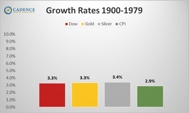
The next chart shows how these four rates changed over the course of 79 years, through 1979. By adding four more years to our analysis below, we can see that the growth rates on the three assets are nearly equal over 79 years, with the official government measure of inflation, CPI, being not too much lower.
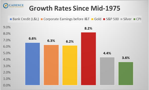
When we shift to looking at growth rates since 1975, we find very similar growth trajectories for bank credit (money supply), corporate earnings, and gold. This makes very good sense, as all three should similarly reflect the supply of money within the system. However, we notice that silver, as opposed to returning somewhere around 6%, returned in the mid-4% range. This could reflect silver being an industrial metal as opposed to more purely a monetary one, but it more likely reflects the fact that silver is simply underpriced right now relative to other assets. The fact that silver performed nearly identically to gold over the 79 years since 1900, along with the fact that copper, a less precious and arguably more industrial metal than silver performed better since 1975, further supports the notion that this anomaly reflects a valuation discrepancy. CPI growing at 3.6% likely reflects some genuine disinflation through globalization and technological efficiencies, as well as some formula chicanery to make the figure appear lower than it is. As we saw in the 75 and 79-year periods above, the true inflation figure is likely much closer to the growth rates of bank credit, corporate earnings, and gold.
The giant stand-out in the chart below is the growth rate of the S&P 500, and just how far it is from all the others. If logic, as well as the 79-year period we just looked at suggests that stock returns should approximate the growth in the money supply, then how can we explain this ~2.5% higher annual growth rate for stocks? According to Werner and others, too much of the supply of new money went directly into financial markets and speculation as opposed to productive ventures. Throughout history, every time we’ve had a financial asset bubble, it was due to speculation through the use of leverage, which by definition is new money supply going toward pushing asset prices up rather than creating new, sustainable wealth.
The question is, if in the end, say after a few more years, the stock market growth rate reflects the bank credit (money supply), corporate earnings, and gold growth rates, then what would that mean for the S&P 500? Four years from now, that would mean the S&P 500 would need to be at 2869, down -55% from where it is today. On the other hand, if silver closes the gap in the next few years to where it reflects the same return as gold (6.2%), as it did in the 79 years since 1900, it would trade at $114, up ~200% from today’s price.
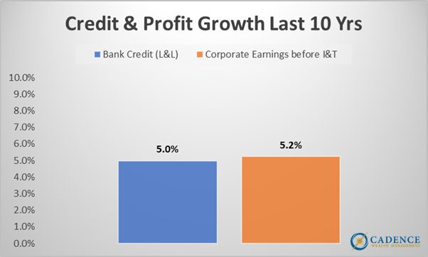
Can an increase in money supply growth catch up to stock market valuations and justify their existence? That’s unlikely. As the chart on the following page shows, money supply growth has decelerated in the last ten years from its 50-year average – 5%, down from 6.6%. This deceleration is likely due to a limited ability of borrowers to service additional debt, along with fewer credit-worthy borrowers in general. In short, if banks don’t feel they can make good money on loans, they won’t lend. We seem to be at a bit of a dead-end on this front. Homes, cars, and just about everything else are too expensive. Something’s gotta’ give.
So, can we continue to expect 10% long-term stock market returns if the money supply and economy are only growing at 5%? Probably not. As opposed to being a convenient magic trick that just is, this discrepancy is most likely the result of a number of factors leading to the speculative misallocation of capital that’s been persistent enough to fool almost everyone. If, in the end, stock returns are similar to economic growth, money supply, and gold, then we have some pretty serious downward adjusting to do. The 79 years since 1900 support it, logic supports it, and a whole lot of mean reversion math based on a host of valuation metrics argues for it. Probably not coincidentally, the numbers all agree fairly well – at least half of the stock market is most likely ephemeral, temporary wealth, that will vanish from retirement accounts at some point. The world will feel very different at S&P 2869. If our definition of wealth depends on the level of the stock market, this won’t be a welcome change. If we define wealth more broadly, in terms of sustainability, happiness, and depth of human experience, then it may be a necessary, albeit unpleasant, first step toward actually achieving it.
Editor’s Note: This article was originally published in the August 2025 edition of our Cadence Clips newsletter.
Important Disclosures
This blog is provided for informational purposes and is not to be considered investment advice or a solicitation to buy or sell securities. Cadence Wealth Management, LLC, a registered investment advisor, may only provide advice after entering into an advisory agreement and obtaining all relevant information from a client. The investment strategies mentioned here may not be suitable for everyone. Each investor needs to review an investment strategy for his or her own particular situation before making any investment decision.
Past performance is not indicative of future results. It is not possible to invest directly in an index. Index performance does not reflect charges and expenses and is not based on actual advisory client assets. Index performance does include the reinvestment of dividends and other distributions
The views expressed in the referenced materials are subject to change based on market and other conditions. These documents may contain certain statements that may be deemed forward‐looking statements. Please note that any such statements are not guarantees of any future performance and actual results or developments may differ materially from those projected. Any projections, market outlooks, or estimates are based upon certain assumptions and should not be construed as indicative of actual events that will occur. Data contained herein from third party providers is obtained from what are considered reliable sources. However, its accuracy, completeness or reliability cannot be guaranteed.
Examples provided are for illustrative purposes only and not intended to be reflective of results you can expect to achieve.