As of the moment I’m rapping on these keys, the market as measured by the S&P 500 is down roughly -5% so far this year, with its peak to trough drop of around -12% happening from mid-February through mid-March. That’s been enough to get some people anxious that declining portfolio balances could get worse, while others, with plenty of support from financial media, are viewing this decline as an opportunity to buy more of their favorite stocks cheaper. Only time will tell which group is correct with respect to this particular decline and over a short timeframe, but as we stretch out our time scale and consider the bigger picture, it’s fairly clear to us that the nervous group has reason to be concerned.
In assessing the bigger picture, what we observe is that both financial markets as well as economic and social trends are what we’d consider extreme. It’s been a slow build, but most would agree, regardless of persuasion, that markets are nuts and people have lost their minds. It’s no coincidence that these things track in the same directions over time, and there’s good reason for it. It goes a little something like this: When financial markets rise for prolonged periods of time, the wealthy individuals within society who hold most of the assets become disproportionately richer than those holding fewer assets. This newfound wealth makes financial markets a larger focus within society since speculating seems more lucrative than the grind of hard work. The increased emphasis on financialization rather than production leads to a focus on short-term results rather than long-term investment. If offshoring employment increases share prices, then shareholders are prioritized over employees, etc. As this financialization trend progresses, debt levels increase, productivity drops, and economic activity is stolen from the future and brought into the present. As this trend matures, economic activity stagnates, the wealthy are wealthier, and the middle and lower classes within society become disenfranchised and feel as though they’ve been left behind. It’s not hard to see why social discord and societal unrest can go hand-in-hand with financialization trends that run too far, for too long. We are forty years into this one.
The Great Divide
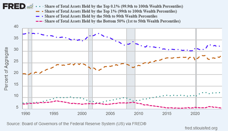
If we look at the share of total assets held by various groups of Americans, what we notice is that the wealthiest 1% hold nearly as much as the 50th to 90th percentile group we’d consider the middle class – 28% of total assets vs. 32%. What’s more concerning is that the bottom 50% of Americans only hold 5.6% of the assets, which is very close to an all-time low. This isn’t to say that everyone should own the same amount of stuff within a society, but it certainly makes evident the shifting trends between the haves and have nots. As you can see from the chart below, the gap between those two groups has fairly consistently widened over the last 35 years, which not so coincidentally, happens to overlap one of the best periods for financial markets in U.S. history.
The Solution
As much as human beings in policy-making positions would like us to believe they have the solution to economic imbalances within society, they do not. Sure, a tweak here and there can staunch some bleeding, but it can’t fix the reason for the bleeding. And politics aside, taking from Peter to pay Paul isn’t a realistic solution in a free society. Only those who aren’t Peter would support this idea, and even a dignified Paul wouldn’t feel good about it. The most effective solution is relatively simple: Don’t allow those with the bulk of the assets to manipulate asset prices higher and take actions to prevent them from going lower. This, in the form of the “FED put”, chronic low-interest rate policy, FED and bank purchases of securities to support prices, and government bailouts of high net-worth banks, are ways that those with the assets control the assets. It’s gross, anything from free and fair, and horribly destructive over time for society. What you’ll notice in the chart above is that recessions (often coinciding with financial asset/stock market drops) are periods of time when wealth disparity somewhat abates. It’s not rocket science, since falling asset prices disproportionately affect those with more assets, but ask yourself this: If people claim to be serious about solving wealth inequality, why are they so reluctant to let markets run their natural course? Oftentimes by contrast, why are they supportive of policy actions that perpetually support financial markets? Answer: It’s because they have assets and those controlling their viewpoints (wealthy friends, colleagues, and lobbyists) do as well. The solution to wealth division across society is avoiding making financial markets central to our society, and to not let those in positions of power influence them. Markets must be allowed to ebb and flow based on natural inputs that will reward those taking productive, intelligent risks, while penalizing those engaging in reckless, deleterious behavior. Those able to navigate financial markets intelligently and constructively without special favor can still amass great wealth, but they’ll do it without cheating and fixing the game against those with less. We’re kidding ourselves if we think the current landscape represents free market capitalism. It is socialism for the wealthy. True free market capitalism would see reckless hedge funds, banks, and corporations go out of business and lose everything far more often than they currently do, which is almost never. This reality might have some reassessing their views on capitalism and socialism, a very charged topic. It’s fair to say there’s a lot more gray in the subject than most think.
What Now?
Financial assets won’t stay historically expensive forever. If there’s a silver lining in all the political drama we’re witnessing at the moment, it’s probably that it represents a major shift in direction from wealthy capitalists and elite institutions being in control to the less wealthy wage-earners wrestling back some power and autonomy. As much as the media would like us to believe that Trump represents the interests of wealthy oligarchs, the reality is that the movement we’re witnessing that got him elected, especially as it aligns with a historically wide wealth divide favoring capital over labor, is a clear rebuke of a system that has failed so many on the lower rungs of the economic ladder. What the asset ownership chart above screams to us is, “We’re sick and tired of the bankers and policy-makers (wealthy) rigging the game for themselves, friends, and family (also wealthy), and it’s about time we do something about it”. We could either allow ourselves to be convinced that these people have no legitimate beef and are just trouble-makers, or we could understand the bigger picture and appreciate it for what it is. Getting caught up in people, personalities and political issues can distract us from understanding the underlying cause of today’s problems. The root of the issues surrounding us is economic. The reality is there are far too many people right now who are struggling financially, and in a wealthy country that can never be status quo. I think what we can expect might happen at this point is major change that focuses on that wealth disparity, which would almost certainly facilitate the repricing of financial assets.
So, here’s where we’re at:
- Financial assets (stocks and credit instruments) are like an old bulging tire with a thousand patches on it. Barely enough good rubber to hold it together.
- Interest rates are too high to keep the markets and economy lubricated.
- Powell and the FED tried to lower rates to remedy that, but found that the long end of the bond curve, the interest rates that markets rather than the FED dictates, moved higher, not lower. The exact opposite of what the FED wanted and needed.
- Inflation is still on everyone’s minds; and rightly so. Inflation affects the average person far greater than it does the wealthy, further exacerbating the wealth gap. Therefore, any attempt the FED makes to put another patch on the stock market tire via lower interest rates (short term) will be counterproductive and potentially restrictive (higher rates on the long end of the duration curve). Long duration rates fear an inflation resurgence.
- Therefore, and especially given the current political movement underway, the powers that be might have to let stocks prices correct lower. In other words, in order to preserve the life of the driver (economy, credit markets, and best attempt at status quo), policy-makers might have to let the tire go flat and suffer the consequences of missed appointments and immobility for a period of time, until a new tire can be secured.
- In sum, this would be a reasonable time to let stock markets deflate, which they appear to be doing at the moment. A win for Trump as he can get it out of the way and hope for better performance on the back nine, and a win for the opposition as they can pin a crumbling market and economy on their political adversary.
Action Steps
As we’ve talked about quite a bit, it’s almost impossible to make money and keep it when investing toward the end of an asset price up-cycle. The math just doesn’t work, and sadly, that’s what many investors are likely about to find out if they’re too heavily concentrated in big tech and other pricey sectors of the market. Seeking assets closer to the beginning of their price cycles is a much better bet over time. Frustrating in the short term, yes. Sometimes. Eventually however, the math just works – buy something cheap and eventually more buyers show up. That’s precisely what we’re seeing in precious metals categories now and we suspect that demand will broaden out across other commodity sectors in time. Certain categories of fixed income also appear attractive at the moment given their dramatic underperformance in recent years (U.S. Government Bonds).
We’ve talked about this transition from one bull market to another as a baton-pass, where when the music in the former finally stops, the baton is passed to the latter. We may be witnessing that handoff now. Only time will tell, but the chart below of performance differences between major asset categories so far this year suggests investors are clearly favoring precious metals-related categories over stocks as anxiety rises. That’s probably not by mistake.
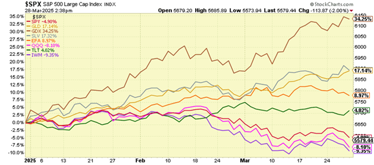
Intelligent investors understand the differences in price and value, and where each of these broad categories are relative to their long-term cycles. One is near the end, and the other the beginning. If the past is even approximate prologue, the future holds very different outcomes for each. The fairly dramatic performance differences we’re seeing in the chart might just be the opening chapter of a much longer story. With gold miners, silver, and gold (GDX, SLV, GLD) at the top of the heap so far this year, and small cap stocks, tech stocks, and large cap stocks (IWM, QQQ, SPY) at the bottom, and in red, it paints a picture of a shifting prioritization from paper financial assets back to real, hard assets. David is standing up to Goliath. If stock markets get chaotic, we can take that to be one of the indications that he’s winning.
Editor’s Note: This article was originally published in the April 2025 edition of our Cadence Clips newsletter.
Important Disclosures
This blog is provided for informational purposes and is not to be considered investment advice or a solicitation to buy or sell securities. Cadence Wealth Management, LLC, a registered investment advisor, may only provide advice after entering into an advisory agreement and obtaining all relevant information from a client. The investment strategies mentioned here may not be suitable for everyone. Each investor needs to review an investment strategy for his or her own particular situation before making any investment decision.
Past performance is not indicative of future results. It is not possible to invest directly in an index. Index performance does not reflect charges and expenses and is not based on actual advisory client assets. Index performance does include the reinvestment of dividends and other distributions
The views expressed in the referenced materials are subject to change based on market and other conditions. These documents may contain certain statements that may be deemed forward‐looking statements. Please note that any such statements are not guarantees of any future performance and actual results or developments may differ materially from those projected. Any projections, market outlooks, or estimates are based upon certain assumptions and should not be construed as indicative of actual events that will occur. Data contained herein from third party providers is obtained from what are considered reliable sources. However, its accuracy, completeness or reliability cannot be guaranteed.
Examples provided are for illustrative purposes only and not intended to be reflective of results you can expect to achieve.