Everyone knows the expression “playing with fire” is a way to say someone is engaging in risky behavior, and it is frequently implied the consequences of that behavior could be particularly painful. Yet, we couldn’t live without fire, be it a furnace, or an oven, or even a nice fire in the fireplace on a chilly winter night that makes the season’s weather tolerable, if not downright cheerful. We couldn’t live without fire, yet playing with it is how we describe overly risky behavior.
Volatility in an investment portfolio can be useful like the properly controlled fires we use on a daily basis, or it can be the kind that invites disaster; it all depends on how much potential downward volatility lurks within your portfolio relative to how much risk you should be taking at that particular time. We have written many pieces discussing investment volatility, especially relative to the likelihood of experiencing large investment losses. In general, the larger the portfolio’s volatility measure, the larger the potential investment loss. As a result, volatility has more of a negative connotation than a positive one relative to investing. That’s fair, but volatility can skew toward the upside at times and isn’t just reserved for downward moves. Without risk we couldn’t get much growth, and even those things that one day are deemed too risky to own at a high level will eventually turn into things that are worth loading up on. Just like the fires we use on a daily basis, volatile investments have their time and place.
Statistically speaking, the less volatile an investment, the more likely it is to achieve its expected rate of return. Consider two investments which average a 6% rate of return, with one we’ll call “Smooth” having a 0% volatility measure, and the other we’ll call “Bumpy” having a 30% volatility measure:
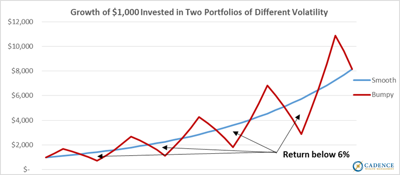
Even though both of these investments earn 6% over this time period, the more volatile of the two actually returns less than that 44% of the time. Since investments that promise and then deliver a return high enough to achieve a long-term goal are few and far between, we usually have to live with some amount of volatility to achieve our goals, so it behooves us to use it to our advantage when we can. This simple chart shows Bumpy’s volatility pretty evenly spread around Smooth’s returns, but by being careful to include volatility when it is more likely to lead to upward volatility and not downward volatility, an investor can increase the likelihood that the fire in his or her portfolio is of the beneficial variety.
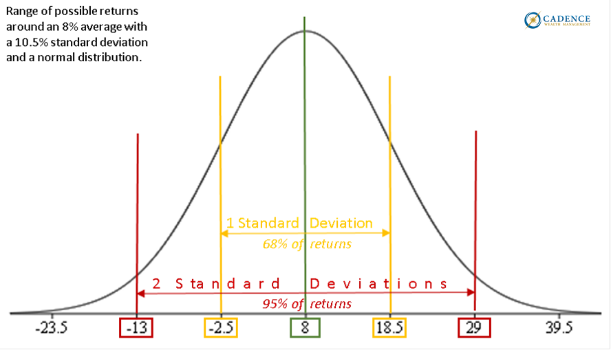
One way to measure portfolio volatility is by the statistical calculation called “standard deviation”. As the name implies, this measures how much something deviates around a standard, and the standard for our purposes is the portfolio’s long-term average rate of return. Determining a portfolio’s potential range of returns is refreshingly uncomplicated; you just need to know its average return, its standard deviation, and a couple facts regarding “normal distribution”. Remember bell curves? A bell curve follows a normal distribution pattern, with the average being in the middle of the curve, and the further away from average something falls on the curve, the more standard deviations it is from that average. Adding all these concepts together, we get that a portfolio with a long-term average annual return of 8%, a standard deviation of 10.5%, and a normal distribution pattern will have around 68% of its annual returns between 18.5% and -2.5%, and 95% of its annual returns between 29% and -13%. All you have to do to get those ranges is add and subtract the standard deviation to and from the average once to get the first range of returns, and add and subtract once again to get the second range.
Hopefully we didn’t just trigger bad memories of those days where your exams and papers were graded on the curve and compared to all others. It’s either fascinating or scary to consider the same things used to measure the volatility of an investment also determined if you got an A, a B, or a C on your history mid-term.
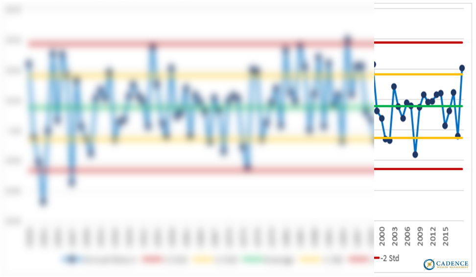
The portfolio we just described is actually one comprised of 50% S&P 500 and 50% 10 Year Treasury bonds rebalanced annually. Between 1928 and 2019, this portfolio returned 7.8% on average with a standard deviation of 10.5%. Now, with some reservation we’re going to include a chart detailing this portfolio’s returns and standard deviation bands over time. After the tutorial you’ve just read on standard deviation, we think you’re ready for this, so hang with us because this particular chart is a bit of an assault on the eyes. Without further ado, we present the very busy chart showing the annual returns of a half S&P 500, half 10 Year Treasury Bond portfolio since 1928 rebalanced annually, and with lines showing long-term average and standard deviations:
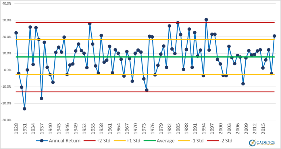
Are you seeing spots? Each blue dot is the annual return of the portfolio in a calendar year, and the light blue line connecting them all is to make it easier to see the returns from one year to the next. The green line is the portfolio’s long-term average return of 7.8%. The gold lines are one standard deviation above and below the long-term average, and the dark red lines are two standard deviations above and below the long-term average. Picture the bell curve on its side. This is a pretty normal distribution, statistically speaking.
Now that you’ve looked at it a little more without going blind, we’re going to point out just how volatile this 50/50 portfolio’s annual returns were at times. There is a 26-year period from 1973 through 1998 where the annual returns fall within one standard deviation of the average only 46% of the time. Considering annual returns should fall within one standard deviation of the average 68% of the time but for this stretch they did less than 50% of the time, we’d consider 1973 through 1998 to be a relatively volatile period. Notice how many times the blue dots are above or below the gold lines for this period here:
The next 21 years, between 1999 and 2019, were a fair bit less volatile, with the returns of only 4 of those 21 years falling outside of one standard deviation from the long-term average. Since falling outside of one standard deviation should happen around 32% of the time, but for this period it happened only 20% of the time, we can say it was a 21-year period with less than average volatility. Notice how often the blue dots practically hug that green average line and stay inside the one standard lines for this period here:
The higher volatility period for the 50/50 portfolio paid off, with an average annual return during that stretch of a little over 11% per year, well above the long-term average of 7.8%. Conversely, for the following lower volatility period, the portfolio averaged only 6.3% per year. This is an example that valuations, economic cycles, and other factors can reward those who own the right assets, higher volatility or otherwise, at the right times, like for that lucrative stretch from the 70’s through the 90’s. The next 21 years saw stock market valuations grow to historical highs right before the tech and real estate bubbles burst in the early and late 2000’s. Even though the 50/50 portfolio’s volatility was lower than its long-term average at that time, it was still not a great time to take risks with certain asset classes, as the stock market’s volatility trended violently downward for much of the 2000’s.
So, wait a minute. We just got done telling you on the first page that a more volatile investment decreases your chances of hitting a particular target rate of return, yet now we’ve contradicted ourselves with actual data and shown that more volatility is somehow better?
Well, not exactly. The first example was comparing two different investments over the same time period, whereas the second example was showing the same investment mix over different time periods. That’s a very important difference and we want to make sure there is no confusion between those two points. Though the 50/50 portfolio was more volatile than its long-term average between 1973 and 1998, it was still less volatile than an all-stock portfolio, so anyone needing a 10% return, for example, would have achieved their target return in the less volatile (smoother) 50/50 portfolio without needing to invest in a more volatile (bumpier) all stock portfolio.
Which brings us to our final point: how can we include volatility in a portfolio so it is the kind of fire that heats your dinner and not the kind of fire that burns a house down? All investments carry some level of risk, and it changes over time. When any asset class’s valuations are toward the historically high end, that’s when you’re more than likely playing with fire; when they’re toward the historically low end, that’s when you’re more than likely cooking with gas. When asset valuations are high, their forthcoming volatility has a greater chance of being of the downward, detrimental variety; when asset valuations are low, volatility has a greater chance of being of the upward, beneficial variety.
In addition, having a good understanding of where we are in the economic and inflation cycles can also steer us toward the right type of volatility. While certain asset classes tend to perform better in an accelerating growth environment, others can perform relatively better in a decelerating or contracting growth environment. The same is true when we add inflation to the investment picture. Price inflation or deflation affects asset classes differently. Understanding where we most likely are along the sine curve of these varying cycles can help us avoid a wild fire of volatility.
Two investment categories we believe currently have relatively low valuations that may perform well in a decelerating growth environment with higher inflation are precious metals and mining company stocks, which is why our separately managed portfolios and our core diversified portfolios include allocations in one or both categories. This is not to imply that identifying which asset classes are likely to have upward trending volatility by comparing valuations and historical measures is foolproof, because it is not. Assets that seem ripe for a downward move can continue climbing longer than seems logical, and assets that seem like a good bargain can keep falling in price even after you’ve added them to your portfolio. However, reducing exposure to an expensive asset class that keeps growing and increasing exposure to a cheap asset class that keeps shrinking can often times be rewarded by patience and faith that expensive and cheap assets cannot stay that way forever.
Like heat sources in your house, volatility is less something to be completely avoided and more something to be carefully managed. Ultimately, the main drivers of the risks you take with your investments should be how much you can or cannot afford to lose, your timeframe for investing, and where investment valuations are currently, but paying attention to an asset’s or a portfolio’s volatility measures are a good beginning point for understanding just how much potential volatility you are carrying. Now is probably not the right time to load up on equity investments as their valuations were high even before a global pandemic-fueled recession. Volatility like we’ve experienced recently is normal, and has occurred many times in the past and will again in the future. Managing that volatility and using it to our advantage allows us to buy more of those assets we believe have a chance to boost portfolio returns in the coming years and avoid those we feel could burn us. Though a fire in the winter makes you feel safe and cozy, we contend that properly managed investment volatility is equally heart-warming.
Editors Note: This article was originally published in the September 2020 edition of our “Cadence Clips” newsletter.
Important Disclosures
This blog is provided for informational purposes and is not to be considered investment advice or a solicitation to buy or sell securities. Cadence Wealth Management, LLC, a registered investment advisor, may only provide advice after entering into an advisory agreement and obtaining all relevant information from a client. The investment strategies mentioned here may not be suitable for everyone. Each investor needs to review an investment strategy for his or her own particular situation before making any investment decision.
Past performance is not indicative of future results. It is not possible to invest directly in an index. Index performance does not reflect charges and expenses and is not based on actual advisory client assets. Index performance does include the reinvestment of dividends and other distributions
The views expressed in the referenced materials are subject to change based on market and other conditions. These documents may contain certain statements that may be deemed forward‐looking statements. Please note that any such statements are not guarantees of any future performance and actual results or developments may differ materially from those projected. Any projections, market outlooks, or estimates are based upon certain assumptions and should not be construed as indicative of actual events that will occur. Data contained herein from third party providers is obtained from what are considered reliable sources. However, its accuracy, completeness or reliability cannot be guaranteed.
Examples provided are for illustrative purposes only and not intended to be reflective of results you can expect to achieve.